Data journalism is the art of reporting a story enhanced by data. It is about using a strong news instinct to identify how a story can be told with the digital data and information that is now available to us.
If you’ve ever seen a graph or an infographic in a news story, then you have seen data journalism in action. The manner in which the data is actually broken down is crucial to the story’s success, as it needs to be digestible, and offer value to the reader.
Data Journalism Is on the Rise
There has been a marked increase in the use of data journalism recently, particularly data that is displayed in charts and maps, whether in print on online. Of course, the rise of “Big Data” means there is more data available publicly. And there has been growth in the tools to gather, interpret and represent the data.
The real benefit of data journalism is get to the point of a story faster and more efficiently, which will often mean digital publishers will be more likely to pick it up and run with it.
Essentially, it’s always in your interest to make the data clear and easy to understand. The use of visual images, such as graphs, pictures and other techniques often enhance effective processing, so use them to your advantage.
Including a graph in your content, or including the findings of a survey to support a story can count as data journalism, as well as whole stories constructed around a central data point. Essentially, anyone can report stories with data, you’ll just need some basic building blocks but you can soon be on your way to sourcing great stories through numbers.
Data Journalism Examples
To help spark creativity and interest in data journalism, I’ve compiled a few examples to showcase the value data journalism can bring to a story.
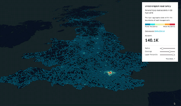
Uber offers an open source version of the data visualisation framework it uses internally for exploring and visualising data assets at scale. It’s a really interesting and engaging way to interpret their data.
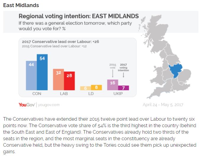
YouGov actually employs data journalists and frequently uses statistics to visualise the latest news and current affairs. This example shows the UK’s regional voting intentions, and shows the Tory tide rising across the country. For the full breakdown, visit – https://yougov.co.uk/news/2017/05/15/voting-intention-regional-breakdown-apr-24-may-5/
Proving that not all data journalism has to be super serious, the BBC uses data to create interactive questionnaires to intrigue and engage audiences.
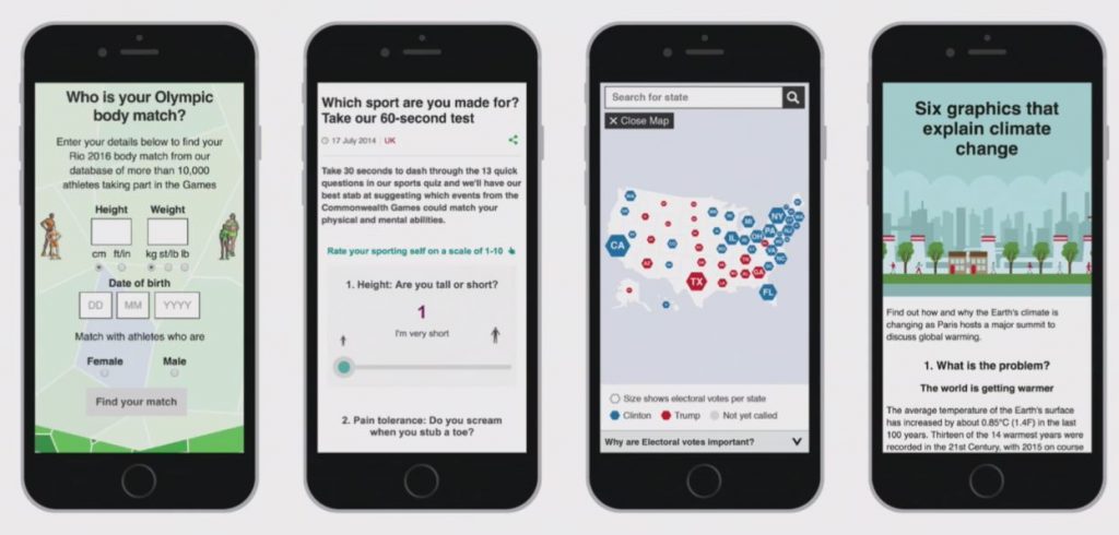
The BBC often looks to data made available by governments, international organisations, companies and other reputable sources to back up their news stories.
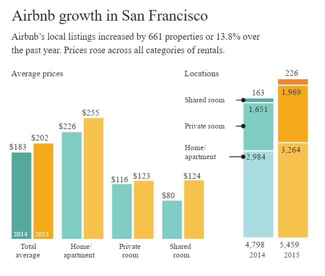
It’s not just national news organisations who have become adept at data journalism, local publications are investing in data journalism too. The San Francisco Chronicle used data to visualise Airbnb and its effect on local housing markets. You can see the story here – http://www.sfchronicle.com/airbnb-impact-san-francisco-2015/#1
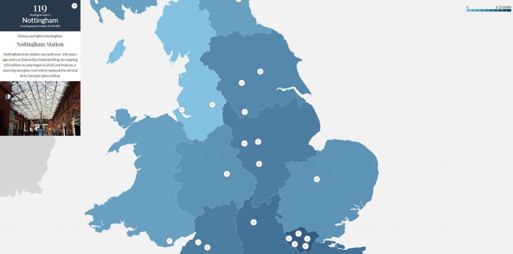
Data journalism can also be interactive like a recent project Hallam has done for Roof Maker. We’ve mapped out some of the most stunning glass work in a selection of the UK’s cities in an interactive map. From beautiful Victorian iron and glass roofs to magnificent modern glass structures, on this map you can find out information on the top glass roofs across the UK. You can find the interactive map here – https://roof-maker.co.uk/interactive-map/
The Data Journalism Process
So, how do you go about pulling together a story that incorporates data?
1. Finding the data
Firstly, you have to find the data. Creative thinking is your best tool for finding the data, but there are some tried and tested sources of data frequently used in data journalism:
- Freedom of Information Requests: The Freedom of Information Act (FOIA) gives you the right to access recorded information held by public sector organisations.
- Statistical Compilations: government departments, trade associations, research organisations all make create compilations of data. The ONS is the UK’s largest independent producer of official statistics and the recognised national statistical institute of the UK.
- Proprietary Data Sources: scouring company annual reports and sales figures.
You should try and keep an open mind so that you don’t interpret the data in a preconceived way.
2. Organising the data and finding the story
Once you have your data, you need to get rid of any jargon, or duff stats, to gain a better understanding of it. You should always look at the wider context that the data sits in. The hard part of working with data is often organising or interpreting it in a usable format to enhance the story.
You then need to find the stories in it. This is the fun part, as you can often find insights you never expected but you still need to tell the story, as sometimes the data doesn’t speak for itself.
3. Visualising data
Turning large data into a relatable visual often requires a content journalist or PR to spend hours poring over spreadsheets to find the story. This is all before figuring out the best way to represent the information in a straightforward and easy to understand manner. It can involve a lot of trial and error while feeding figures into visualisation programs. Alternatively, many PR and marketing departments now have access to developers and designers who can make data look great.
Once you’ve explored your data and found your story, you can start making it engaging. Make sure you’re telling a story, or supporting a story with the visuals. Visualising and combining data is usually the responsibility of designers and coders but there are an increasing number of people with editorial backgrounds trying their hand at it too. It is now easier than ever to visualise data on a small budget, there are loads of free data visualisation tools available on the internet. See this blog for the top free visualisation tools.
Lastly, remember that your story is only as good as the visuals you use to tell it. The data is only a part of your story, and it is up to you to communicate its importance and relate it to relevant insights. For inspiration, I really enjoy looking through http://www.informationisbeautiful.net/
If this blog post interested you and you’ve made it this far, then perhaps take a look at The Guardians 10 point guide to data journalism.