
Back in 2016, the combined number of mobile and tablet users finally surpassed the number of desktop users globally. And the trend today shows no sign of stopping.
This fact means that it’s essential that web developers ensure people on screens of all sizes have a good user experience and are therefore more likely to convert. Website owners may use a responsive web design, have to create two or three versions of a website or create business apps to offer a good user experience on all devices.
Since 2015, having a website that’s not mobile-friendly affects Google’s search engine rankings for mobile searches. And now we have mobile first indexing which exclusively looks at the website experience for mobile devices. So it’s clear that optimising for mobile-friendliness is the way to go.
Visitors using a smartphone to browse a website that’s not mobile-friendly will on average:
- Spend less time browsing the site (smartphone users are quick to give up on a bad website)
- Be less likely to perform any desirable actions (such as making a purchase or calling a phone number)
- Be more likely to return back to the search engine results (to visit another website)
It’s really important to look closely at how your mobile and tablet users interact with your website, so you can find out if there are any significant concerns which need to be addressed. Luckily, Google Analytics has the ability to separate out desktop, mobile and tablet traffic so you can look into important statistics once analytics tracking is correctly setup.
Comparing mobile vs tablet vs desktop traffic
In Google Analytics you can see an overview of the different device categories by visiting the “Reporting” tab and then: Audience > Mobile > Overview
On the mobile overview report, you’ll be able to see how the performance of mobile vs tablet traffic compares to that of desktop. The typical way this often manifests is that Mobile & Tablets tend to get a high volume of traffic, but it tends to convert at a lower rate. Of course, each site varies hugely in their breakdown so you’ll have to do that analysis yourself.
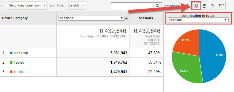
Pie chart report
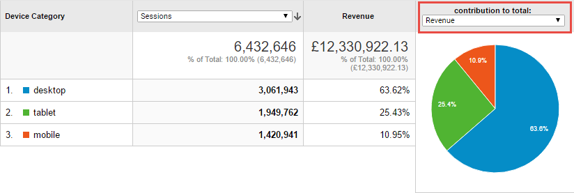
The quickest way to see useful statistics is to click on the little pie chart icon on the right-hand side. Here you can see a visual breakdown of what proportion of Sessions, Goal Completions or Revenue came from each source. The key thing you’re looking for here is if the distribution shifts heavily between each metric. In the below example we can see that Desktop contributes 63% of all revenue from just 47% of the sessions. Clearly, Desktop performance is not an issue.

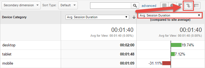
The pie chart tool is great for giving you a quick glance at where everything is coming from. However, if you’re looking to make actual changes it can be very useful to quantify how much better Mobile is doing vs Tablet for example. This is where the comparison tool comes in.
Comparison report
It shows you how a metric is performing compared to the site average, which enables you to highlight the best and worst cases. This is most useful when viewing a per-session performance metric, such as the ecommerce conversion rate or the average session duration:
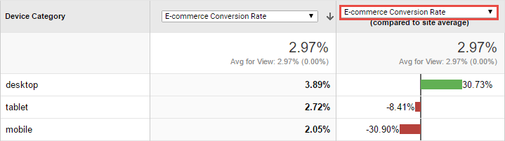
Rather than simply measuring the volume of users. This lets you compare how effectively your website communicates to each user (on average). This allows you to say confidently that “For every 100 mobile users we have just over 2 sales, but for every 100 desktop or laptop users, we have nearly had double!” as shown in the example above. For most websites, the number of visitors on different devices is not as important as how well they convert. In particular, this report is incredibly useful in Paid Advertising. This is because it can directly inform your Device Adjustments that most platforms have.
This same comparison report option can be used for many useful reports within Google Analytics and is well worth having a play around with.
Creating custom device reports
If you are feeling particularly adventurous then you can segment mobile traffic in Google Analytics further using a custom report from the “Customisation” (or “Customization”) tab at the top of Analytics. The example below would show just the organic (SEO) traffic for mobile users who land on the homepage [shortcut link to custom report]:

Custom reports can be used to deep dive into the data in many useful ways. For example, you can look at how mobile traffic performs on different landing pages or campaigns.
The look, feel and way people interact with the websites on mobile vs tablet vs desktop can be very different. The three device types are used in different places at different times. For example, a mobile phone user could be hastily viewing a website whilst on public transport. Meanwhile, the tablet user may be casually browsing a website whilst simultaneously watching television at home. Therefore reviewing as much as possible can deliver you real insights.
Improving mobile and tablet performance
If you improve mobile and tablet performance it can boost the number of overall conversions considerably. Due to the high volume of this traffic even if you only make small adjustments it can have big effects. The key considerations are to try to ensure that visitors either stay on the website longer, or that they find it easier to perform the desired action such as a call, signup or sale.
Certain areas on a website may not function properly on mobile or tablet devices due to many reasons such as:
- Widgets not being supported on a mobile device (for example Flash video players do not work on iPhones)
- Un-clickable popups stopping a website being used on a small screen (obtrusive mobile interstitials)
- Tiny text links or button images which cannot be selected easily on a touch screen (bad mobile user experience)
- Elements of the website overlapping each other (hidden or un-clickable content)
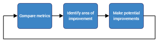
Most websites have over 50% combined mobile and tablet traffic. Therefore it’s vitally important that you get mobile right by identifying where improvements could be made. To make the best improvements, ensure that you compare metrics such as conversion rate for different devices before and after the change, ideally using split testing software such as Google Optimize, Visual Website Optimiser or Optimizely:
Testing improvements
One great test is to simply pick up different smartphones or tablets and give your website a thorough test on each device. You’d be surprised how many website owners have never tried this simple method out!
An even better test is to watch a real person try to perform a task on your website without giving them any help. Set them off on a task, then note down where they got stuck. Finally, ask them to talk you through their thoughts on the process so you can identify any issues. If you can’t find any real people nearby, then there are useful services like Hotjar. Hotjar lets you record visits on your website so you can watch how they navigate the website and where they encounter issues.
There’s always a tradeoff between good visual design & usability, especially when it comes to Mobile. If you’d like help optimising your website for mobile our CRO team has had a number of successes which you can read about here.


