Colour is actually really complex when you look at the theory – but don’t worry, I’ll break it down. You can learn more about the importance of colour and how it sets the mood here. It may seem simple, but colour is being used to manipulate users into doing what they want.
Theory
There is more to colour than the simple colour wheel we all learnt at school.
Colour vocabulary
- Hue – is the colour you already know so well (blue, red, yellow etc.)
- Chroma (saturation) – the purity of the colour, how intense it is
- Value – how light or dark the colour is (light = high value, dark = low value)
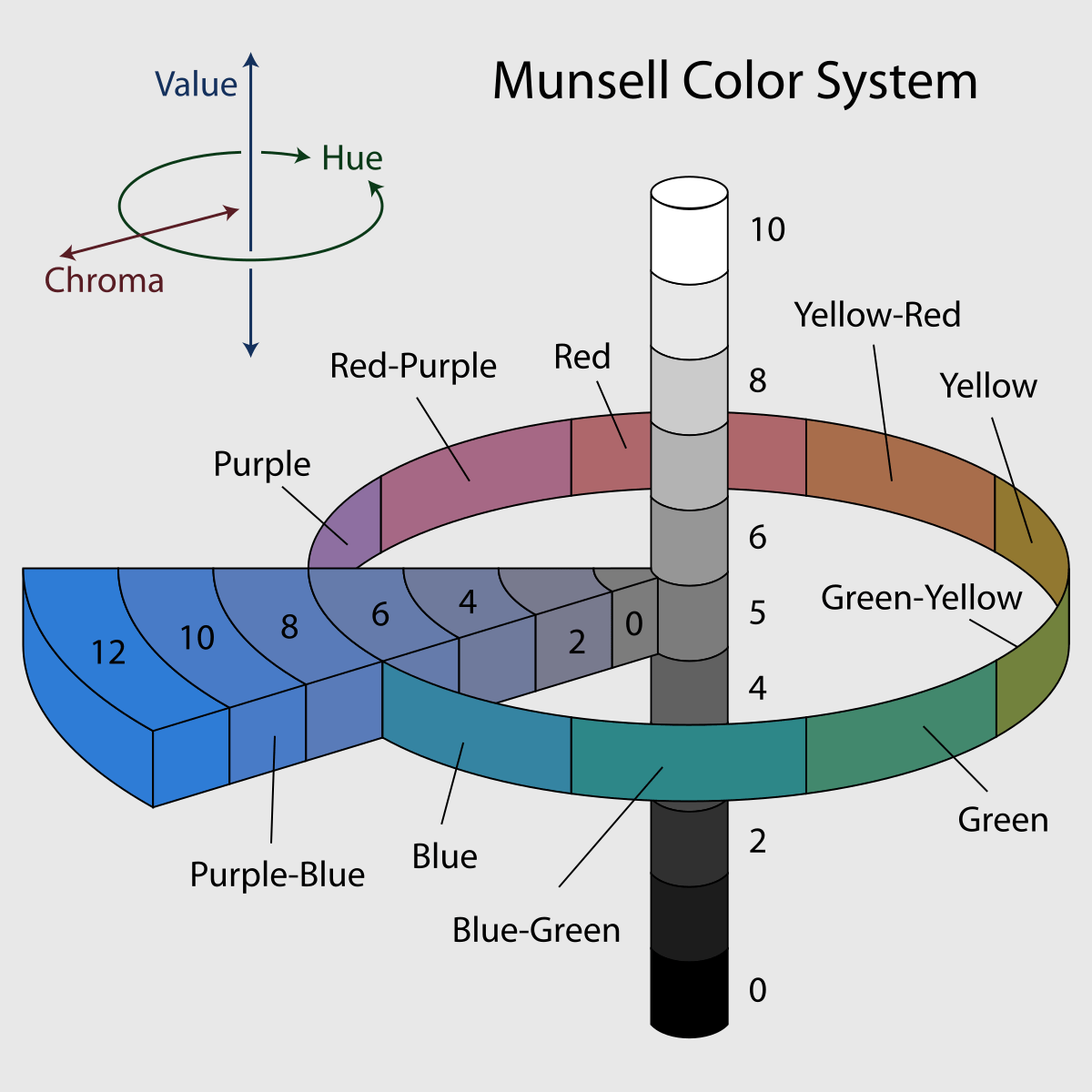
- Tint – when white is added to the colour, making it lighter than the original colour
- Tone – when grey is added to the colour, making it duller than the original colour
- Shade – when black is added to the colour, making it darker than the original colour
Tints, tones and shades are a really important way of expanding the basic 12 colour wheel into hundreds of variations which can then be used to make a unique palette for each design.
Pure black and pure white don’t exist in nature, so it would be unnatural to recreate these in design. Even though you might see what looks like black in a design, really it is infused with another colour. This is how can you can subtly add warmth or coolness to your design. As you can see, the ‘black’ below, isn’t really black – it is a form of really dark red:

Warm colours
These are the reds, oranges and yellows of the colours world and all the variations of these colours in-between. It may seem odd to assign a temperature a colour, after all, it’s just a colour, but there are deep-rooted emotional and cultural implications of colour.
Cool colours
These are the blues, greens and purples of the wheel, including the different combinations of them.
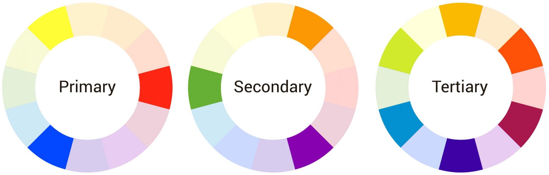
The colour wheel
You may remember the colour wheel from a long time ago where you look at primary colours (red, blue and yellow). These then mix together to create the secondary colours, which in turn mix again to create tertiary colours.
The magic comes in the pairing of these colours. This is the process designers will go through when choosing colours – it’s not just random choice or by chance that certain colours will be found together more often. Below is a diagram of the pairs in relation to their position on the colour wheel.
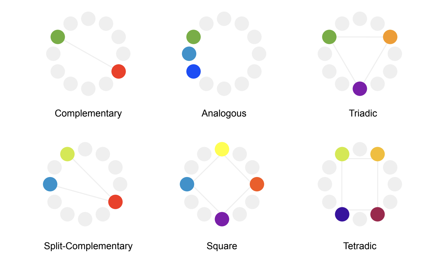
The opposing sides of the colour wheel are referred to as ‘complementary’. They are the most contrasting and so you will often find lots of complementary colours in pop art or modern designs that need to stand out.
Analogous can be on any part of the colour wheel, the example above uses cool colours, but it refers to the colours that sit next to each other in the colour wheel. You know that these will have similarities both tonally and emotionally. A palette of analogous colours can often have quite a calming effect.
This theory was heavily influenced by the German artist Josef Albers who founded the idea that colour is relative. It changes and is influenced by its surroundings. You will always see one colour in relation to another so it is vital that the pairings are right to reflect this.
RGB vs CMYK
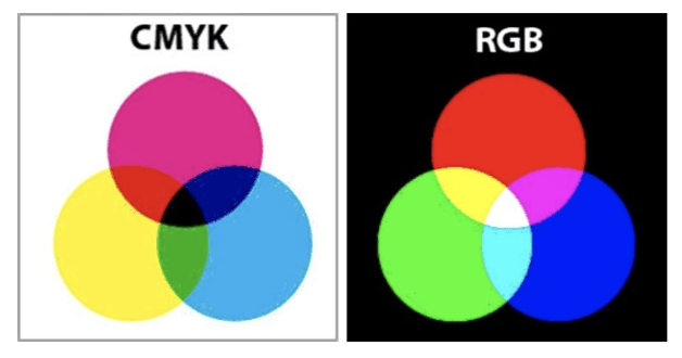
There are actually two different colour systems. They have different primary colours (the colour from which all the other colours derive via combinations of these starting colours) and also have different uses.
RGB
This is the more commonly known of the two, it stands for Red, Green, Blue (and these are the primary colours for this model). RGB is used for digital, so everything on your screen is most likely in RGB. This is for a few reasons, one is because it is additive. If you were to mix all of the colours together, the result would be white. The other reason is that RGB is emissive. It filters the colour allowed through the pixel and essentially emits that colour to your eye.
CMYK
CMYK stands for Cyan, Magenta, Yellow and Black (yes we all know black really starts with a B). Black is needed in this model to make the other colours in combination with this set of primary colours – it is actually an achromatic colour because it has no hue.
One of the key differences between the two models is that if you mix all the colours together, the result would be black. This is because CMYK is subtractive. It is also reflective, which is why CMYK is used for print. It requires a separate light source and it is actually your eye that mixes the colour. Those in print can’t necessarily trust the colour they are seeing on a digital screen and need to have a stack of swatches to be accurate when it comes to colour.
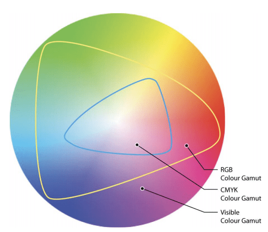
The two different models have different ranges of perceivable colour, which is known as the gamut. Above is a diagram comparing the difference in gamut between the two.
Emotions
Colour has the power to change your emotions. It has a predictable and quantifiable physiological effect that influences our perception and behaviour. That is why it is a powerful manipulation tool.
However, it is all about context. There are some general rules that apply everywhere but colour is culturally and contextually embedded in our lives. For example, the colour red in Chinese culture symbolises good luck, whereas in Russia it symbolises communism. In a more Western setting, red has a stronger association with passion, danger or even appetite.
Similarly, in Chinese culture, wearing a green hat signals that your partner has been unfaithful – yet this would be a simple fashion statement in a place like the UK having a stronger connotation of health and freshness.
Generally, it is well accepted that warmer colours are more likely to create a more energised reaction ranging from excitement to anger whereas cooler colours will generate calmer emotions including sadness.
Can colour manipulate people?
Using colour in relation to emotions can be done in two ways: either to reflect your own emotions or to manipulate someone into the emotion you want. Both are important in a brand. Art therapy is so powerful because the colours people use can express the deeper emotions someone feels, even the colours people wear is a reflection of this.
This means that brands can use appropriate colours to show what they stand for. Brands have a personality and colour is a large factor in showing this.
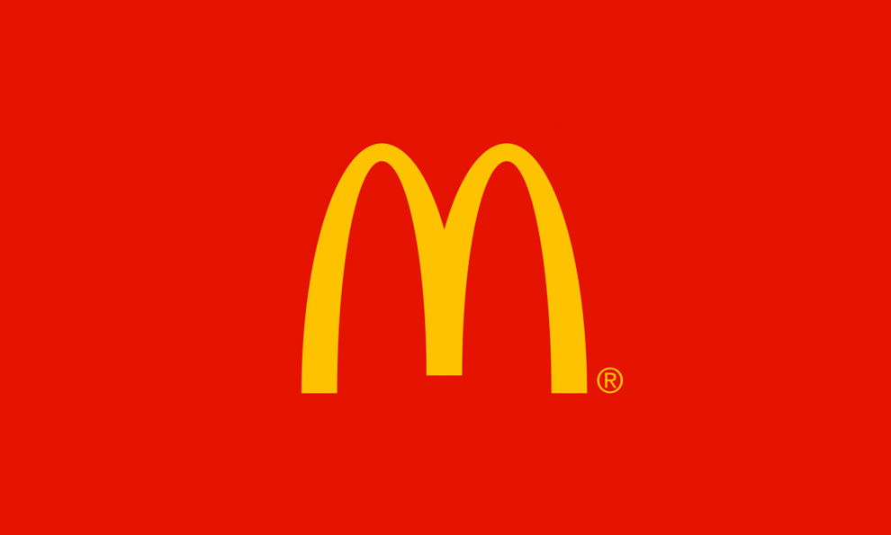
The other method, manipulating your audience through the use of colour, can be done to ultimately get them to complete the action you want. For example, if you are a company in the food sector, you should use warm colours such as red or yellow to increase people’s appetites. This is a known physiological effect because it increases the heart rate and using it will increase your sales. This well-known brand has clearly used this theory:
In design, colour is also a way of teaching people what they are meant to do. For example, call to action (CTA) buttons use a consistent colour palette to teach the user that when they see a certain colour, that means there is an action for them to take (like a Pavlov’s dogs situation).
You may not realise it, but a lot of thinking goes behind the choice of that CTA and effort to make it easy for the user to know when and where they need to do an action.
Ponder the palette
Now you know some of the underlying decisions that are influenced by colour, you may start to see patterns in brand colours or notice the way colours can make you feel different. Every element of design is chosen carefully with theories to support these choices – even something like colour.
If you have any questions or would like to know more about design, don’t hesitate to get in touch with us.