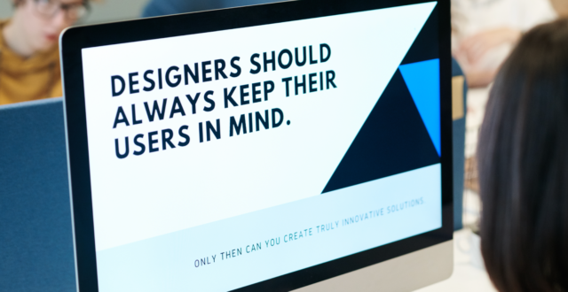
Design isn’t just about making things look pretty. It’s really about manipulating and teaching the user how to use your website. The role of a designer is to map out the pathway a user should take so they can fulfil their needs and everyone is happy.
Often, a user won’t even notice this is happening. That’s because design follows a set of rules that we have naturally learnt from visiting hundreds of websites in our lifetimes.
Composition
Everything you see on a page is there for a reason, and good design will follow a set of rules referred to as Gestalt principles of design.
Human brains are marvellous in that they can fill in the gaps of an image without having to consciously think about it. If you have ever seen a face in an inanimate object, this is your brain doing just that.

The Gestalt principles are fundamentally based on how our brains work. As you go about your day, your brain is frantically trying to simplify and organise a series of complex images every second – all while you simply sip your coffee!
We are built to look for patterns and structure within everything we look at, subconsciously arranging everything into an organised system in our minds. Designers then use this knowledge to design for the subconscious mind using the following principles:
Figure/ground
Figure/ground uses the concept of negative space and contrast. The brain will separate elements into what it considers to be in the foreground and the background. It will take one part of the image and assign it the role of a ‘focal point’, and see the larger area of an image as the background that figure sits upon.
This is often seen in optical illusions, but can be applied to logos and websites. For example, the FedEx logo uses negative space in the logo to create the illusion of an arrow hidden within.
![]()
The negative space between the “E” and the “x” makes it appear as though there is an arrow there.
Proximity
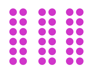
This principle is focused on the idea that the brain tries to group things together. Objects that have close proximity to each other appear to be part of a family. Even if the shapes are identical, their positioning is what makes the user assume the elements are part of a group.
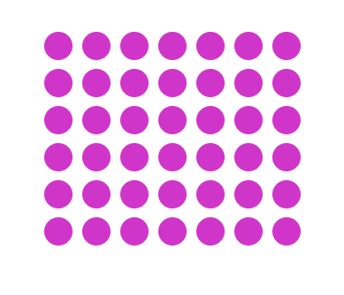
Even though the colour, shape and size are all the same, our brains tell us that these are three separate groups:
Uniform connectivity
This is one of the key ways in which designers “teach” the user how to use the website. This can be done through colour, size and shape. It is safe to assume that the information provided in e.g. circles is of a similar nature and information provided in e.g. squares are of a different nature to the circles.
Continuation
Continuation, or alignment, is based upon the idea that the human eye will follow the simplest path on a page. Therefore, any important information should fall within that line as it is the first place the user will be looking.
It can be done very subtly as the lines direct the viewer’s eye with either literal lines or shapes that naturally fall in a line. This can be seen typically in flowcharts and infographics but also in eCommerce sites on horizontal sliders showing related products.
Grids are a large part of this alignment. Stemming from the idea of simplicity, the Bauhaus art movement originating in Germany in the early 20th Century began the concept of grids.
Colour
Colour is obviously important for brand recognition. As soon as we see the bright golden arches of McDonald’s on a red background we know what it is. These colours weren’t just picked at random though, there is some science behind it.
For example, McDonald’s choice of red and yellow is used because they are warm colours which increase the heart rate and therefore makes you hungrier – and more likely to purchase their food products.
Colour is a lot about emotion. You have to think about who your audience is and what emotions you want your brand to be associated with.
Yellow
Commonly associated with happiness and confidence. Its warm colours make it good for use in the food industry because it can increase appetite. However, there are age factors to consider. Yellow can make babies more prone to crying, yet teenagers and young adults feel more optimistic around the colour yellow. This then changes again as you reach the older demographic who then associate yellow with fear.
Blue
Often used in medical settings and for technology. It has a calmer, serene quality to it and can appear more professional. It also has the opposite effect on appetite and actually suppresses it more.
Purple
Purple is associated with wealth, power and success. This stems from the fact that kings used to wear purple as a sign of wealth as it was one of the hardest pigments to dye cloth with – you had to be very rich in order to obtain clothing in that colour. This has carried forward into our subconscious and gives purple the same connotations as it did hundreds of years ago.
Pink
Pink is known for its calming qualities. Its effects are so powerful the colours are used in prisons to initially calm inmates. It then also has more stereotypical associations such as love and romance.
Orange
Similar to yellow as it is a warm colour, orange conveys emotions of enthusiasm and excitement. It can be used as a more gentle version of yellow as it is more approachable and friendly. Its bright colours also mean it can be used for signs to draw attention or cautions without being as harsh as e.g. red.
Gathering it together
This is just the introduction to design. As you can see there are many elements and a lot of thought that can go behind something that may look relatively simple at first glance. But every brand and website is essentially created via a combination of some of these principles to create the brands and sites you learn to recognise instantly.
If you would like to know more about design, feel free to get in touch with one of our creatives.