

We are going through a digital transformation, with more and more businesses offering their products and services digitally.
User Experience (UX) has become a lot more mainstream and companies have realised it pays off to ensure their website is optimised for usability. This is because providing a good user experience can have a very positive impact on their online conversion.
However, have you ever considered how accessible your website is to the millions of users with impairments?
What is website accessibility?
In short, accessible web design is the practice of making your website usable by as many people as possible. As designers, we often don’t think about people who aren’t able to use the website in the same way we do, which results in them having a worse experience or even being unable to use your service at all.

The latest government data shows that 22% of people in the UK – that’s 14.6 million – are living with a disability or impairment, but there are many more people who may be temporarily impaired (broken arm or another injury) or situationally impaired (holding a baby in one arm, looking at a screen in bright sunlight).
All of these people want and need to be able to use your services in a way that is as frictionless as possible.
Why should I care about website accessibility?
It’s ethical
Website accessibility is the right thing to do. As designers, it’s our responsibility to make sure we design in a way that’s accessible to all users irrespective of their situation, abilities or context.
As a result, the web can be a space which is inclusive to all, whether they have a cognitive disability, visual impairment or physical disability.
To comply with the law
The UK has website accessibility laws in place. In 2018, the UK government made it the law for the websites of central government and local government organisations, some charities and other non-government organisations to be coded and designed to meet the web accessibility standards, Web Content Accessibility Guidelines (WCAG 2.1)
All UK service providers have a legal obligation to make reasonable adjustments under the Equality Act 2010 or the Disability Discrimination Act 1995 (in Northern Ireland).
If companies fail to make reasonable adjustments, they could be taken to court. In 2019, a blind customer successfully sued Dominos Pizza for not providing him with an accessible experience.
Positive business impact
Of course, improving accessibility to your website can also benefit your business in a number of ways:
- It allows more of your users to pass through your conversion funnel.
- Clean code (which improves accessibility) improves your site speed and SEO, making your website more findable in search engines.
- Improving digital accessibility doesn’t just affect users with impairments. Everyone can benefit from accessible web design. By making your website more accessible, you will improve the user experience for all your users.
It takes little effort
Creating an accessible website doesn’t have to require large amounts of budget or big changes. There is no need for additional features or content to make a website more accessible. A lot of issues can be solved with a little thought, planning and awareness, which will be covered later in this blog.
How to test website accessibility
WAVE is a free accessibility checker and evaluation tool you can use to test the accessibility of your website.
You can either paste your URLs into the box on the site, or you can download their extension to quickly run diagnostics on any page you visit.
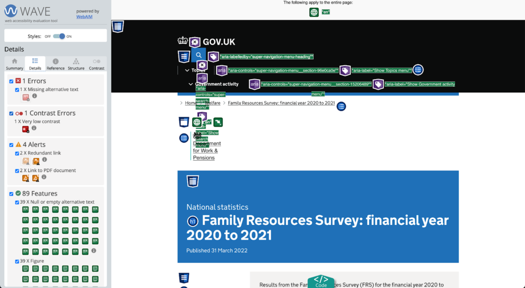
When you run WAVE, it produces a very detailed diagnostics report covering the main areas of accessibility, including contrast errors, alternative text on images and semantic HTML structure.
The reports created by WAVE are incredibly detailed and can be a bit overwhelming, especially if you’re new to accessibility. To give you a clearer overview on how to make your website more accessible, we have pulled out a few of the key areas below with tips on how to improve.
Ways to improve your website’s accessibility
Colours and contrast
Colours and contrast are especially important to allow people with impaired vision and colour blindness to navigate the website easily.
This affects a much higher number of users than you expect. According to the NHS, 8% of all men are colour blind and many more people suffer from some degree of impaired vision. As we have an ageing population, this will be an even more important focus for the future.
Accessible web design ensures there is enough contrast between any text used and its background to allow everyone to read it with ease.
Testing the contrast of the colours used on your website is a quick job with this contrast checker tool. There must be a minimum contrast ratio of 4.5:1 to provide enough clarity for users with impaired vision.
In addition, accessibility guidelines dictate that colour should never be the only way to convey information. In other words, there must be an additional cue (such as underlined text for hyperlinks) for those users who perceive colours differently and may miss our colour-based instructions.
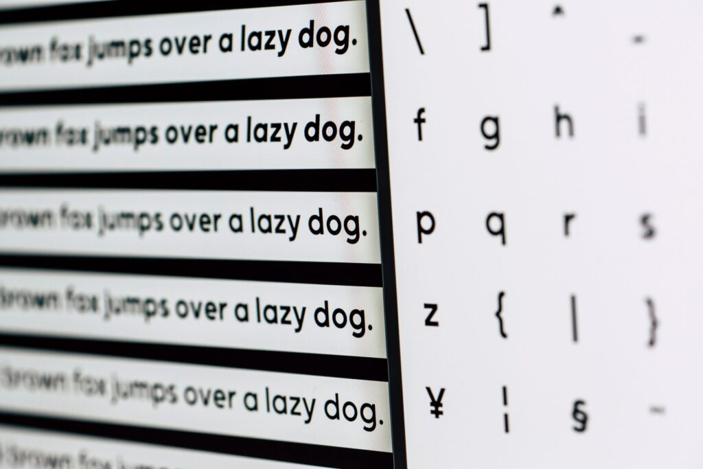
Font choice and size
Font choice and size are also important not just to users with impaired vision, but also helps users with cognitive disorders like dyslexia.
In terms of choice, steer clear of Serif fonts (Times New Roman, Georgia, Garamond). The decorative hooks and swirls at the end of the letter strokes obscure the shapes of letters and cause reading problems for dyslexic users.
The good news is that you don’t need to change your website to Comic Sans to make it dyslexia-friendly. The letters of Sans Serif fonts (Helvetica, Arial, Open Sans, Roboto) can appear less crowded and are widely available in most OS and design softwares.
The default browser body font size is usually 16px (12pt); this is also the minimum advised font size for body text by accessibility guidelines.
It’s not just about text size, though. Increasing the amount of white space between both lines of text and individual words can really help users that are visually impaired or have dyslexia.
The following minimum spacing ensures that the requirements of those users are met:
- Letter spacing: x0.12 the font size
- Word spacing: x0.16 the font size
- Line spacing: x1.5 the font size
- Paragraph spacing: x2 the font size
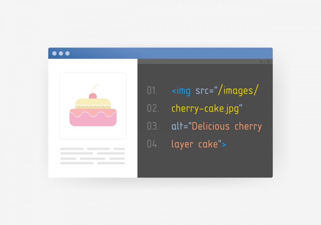
Alternative text
Alternative text (or “alt tag”) is a tag in your HTML code that allows you to input a text description for images.
These text descriptions are used to describe images to visually impaired users who rely on screen readers. This means it is important to accurately describe the meaning or purpose of the image for those who cannot see it.
It may not always be necessary to add alt text. For example, there may be enough contextual indicators surrounding the image or the image has no other function than aesthetic. In this case, add an empty alt tag (alt=””) or it will get flagged as a missing alt tag by diagnostic tools.
Forms
Forms can be complex for anyone, but those with additional accessibility issues can often struggle when forms are too minimalist and unclear. Below are listed some common items that need to be addressed in order to tackle accessibility:
- Labels – using placeholder text as a label rather than text outside the field creates confusion as the text disappears when the user begins to type. Omitting crucial directions for the user in favour of minimalism or aesthetics is a major error to avoid.
- Borders – something as simple as a border around a text input is important for users with cognitive disabilities so it is clear where they need to click.
- Additional instructions – often forms use a minimalist approach in an attempt to declutter the design. However, this hinders the usability and therefore accessibility.
- Error messages – these should be indicated by multiple elements, commonly colour is used but in addition to this errors should be indicated via symbols or text.
- Review – forms should allow a period of review before submission to allow the user to correct any information.
HTML structure
Even when the web page looks good after following the basics above, it can still suffer from severe accessibility issues if the semantic structure of your code isn’t up to scratch.
It’s important to ensure that all content structures are marked up correctly and follow a clear hierarchy, because people using screen readers will use this structural markup for navigation.
An additional bonus is that it also allows Google to better interpret your content which can benefit your SEO.
A piece of simple advice would be to have one <h1> element on your page and then <h2> for your next important sections. If you have a child of a subsection then use an <h3> and so on:
<h1>Usually your page title</h1>
<p>Some paragraph text here</p>
<h2>The next important section of your page</h2>
<p>Some paragraph text here</p>
<h3>Something not so important but related to the h2 above</h3>
<p>Some paragraph text here</p>
<h2>The next important section of your page</h2>
In short
Making your website more accessible doesn’t require a large budget or a lot of time. Using the tips and tricks above can already dramatically change the experience and make it more inclusive for ALL of your users.
Start including accessible web design in your design process now and you will not only create a more accessible and inclusive space for your users, but also improve your standing with Google. It’s a win-win for everybody.
If you need any further advice on website accessibility, please don’t hesitate to contact us.