Online checkouts present the last hurdle from turning eCommerce website visitors into valuable customers. On average, 68% of eCommerce visitors abandon their baskets at checkout. Let’s look at some of the reasons why this might happen, before discussing the ways in which you can encourage your visitors to complete their purchases.
The Checkout Process
Once a item is added to the basket, most eCommerce websites give you the option to view the items added, or to start the checkout process right away.
Checkouts come in all shapes and sizes, but the essential steps required to make a purchase are:
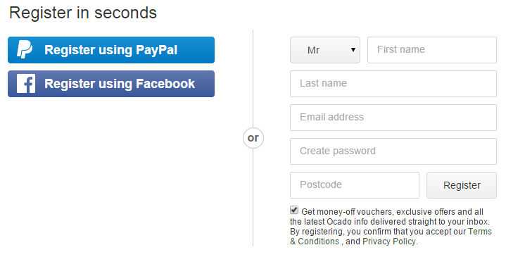
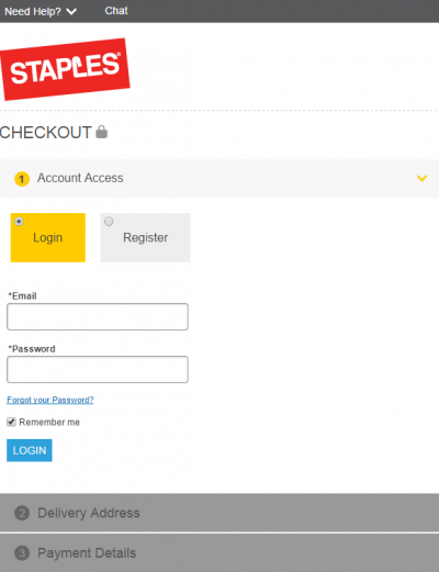
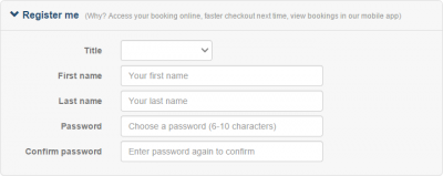
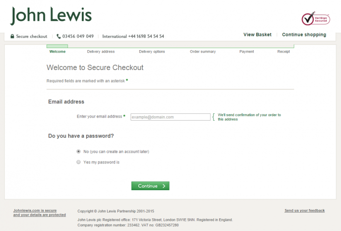
- Register/Login Page – Here you can log in to an existing account, but some eCommerce sites offer a “checkout as guest” option. At this stage, you may be forced to create an account with your email address and a password for future use. Logging in to an existing account usually skips the user information page.
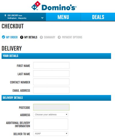
- User Information Page – Here personal details are collected for billing and delivery purposes later on.
- Delivery Page – Here you can specify a unique delivery address if needed, and choose a delivery or collection option.
- Payment Page – Here you enter payment details to pay for the items. This may occur on the eCommerce website, or through an external website such as PayPal or Worldpay.
- Review Page – Here the full order details are laid out for one last review before payment. This page sometimes appears before the payment page.
- Success Page – Here a message is shown that the payment has processed successfully.
Many checkout abandonments occur simply because visitors do not have the time or the patience to complete the checkout process. However, some checkout abandonments occur because visitors encounter technical or usability issues along the way. Streamlining the checkout process can boost your sales, so it’s up to you to address these issues.
Register/Login Page Issues
You have two main options here. You can either force the user to register an account, or allow them to checkout as a guest.
Each approach has its advantages and disadvantages:
- Forcing registration to make a purchase – This allows customers to make quicker purchases in the future, saving user information and delivery details on the eCommerce platform. Also, logged-in visitors may use an account to create a product wishlist, or to be part of an internal social platform. However, if people do not trust your website, they might be unwilling to share their personal details. Similarly, the thought of passwords can put off some users. Some people have difficulty thinking of unique passwords, and others find the required combinations of upper-case letters, numbers, and symbols frustrating.
- Guest checkout option – This allows customers to take the shortest route possible in making a purchase, and it’s a great way to sidestep any potential reservations your visitors might have about their online privacy. Unfortunately, returning customers will have to enter their details should they wish to make subsequent purchases. But if they find this too frustrating, there’s always an option to create an account.
Most major websites require registration within the UK. This isn’t surprising, as there are many advantages in attracting customers to make additional purchases after they first sign up. However, if you are selling one-off luxury purchases, or items that people may wish to buy quickly or whilst on the move, then it’s a good idea to offer a guest checkout option.
User Information Page Issues
Filling out personal details can be a painful process for users, especially on mobile devices that don’t have an Autofill function. At this stage of the checkout process, even the smallest of annoyances can make people reconsider their purchases.

There are several things to check on a registration page to ensure it’s as user friendly as possible:
- Are there too many fields to fill out?
- Are required fields properly labelled?
- If you enter an email address or any other field incorrectly, is this clearly highlighted?
- If you press the back button from the delivery page back to the user information page, does the content remain in the fields?
- Is there any complex password requirements or captcha codes that may hinder progress?
- Does pressing the tab button skip from field to field in a predictable order?
- Does the form view correctly with any browser size on any device?
- Can the form be used on poorly lit screens or if the page is zoomed in or out?
At this stage it’s also a good idea to remove such distractions as the header, footer, and any sidebars. This funnels people through the checkout process and eliminates instances where the user might abandon their purchase having shopped around and reconsidered. Also, if all the user sees is the checkout area, it’s clear what must be done next:
Delivery Page Issues
The biggest mistake that can be made on the delivery page is to surprise users with an unexpected delivery cost. People will expect to pay for delivery for most items, but a large cost could put them off from making a purchase – especially if you don’t offer a “collect from store” option.
Including the cost of delivery within the price of the item can remove this surprise, but this will inflate all of your costs across your entire site, which might put people off from even making a purchase in the first place. It’s therefore worth split testing prices to include or exclude delivery costs to see which method makes the most sales overall.
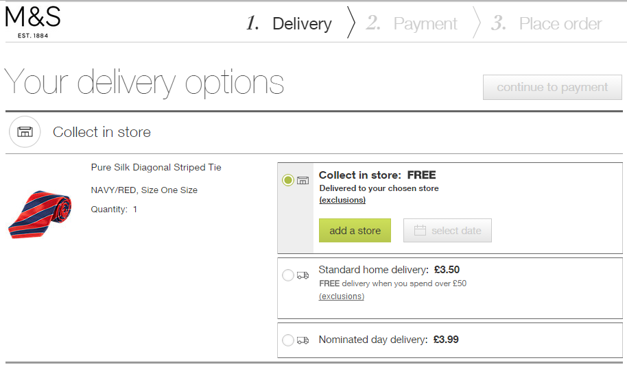
You can boost the average basket value by offering free delivery on orders over a certain amount. For example, “Free delivery when you spend over £50”.
The option to collect from store is usually found on the larger sites with branches across the country, but it can also benefit smaller, more locally-focused businesses. It will help any customers who live nearby, and it might also serve to promote the business locally.
Some websites only allow for the delivery location to be the same as the billing location. This can be a huge drawback for many people who may wish to send their purchases to another address.
Payment Page Issues
The payment page is the last hurdle when converting a website visitor in to a customer. Unfortunately, it’s at this stage where the greatest proportion of abandonments occur. There are many reasons for this, some of which may be out of your control.
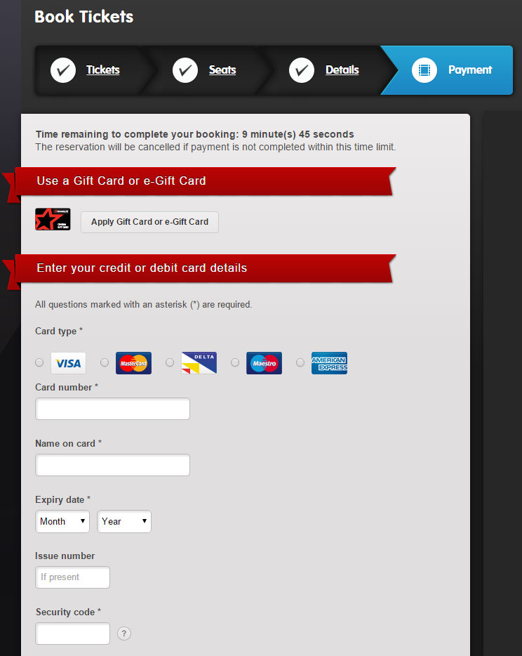
There are many reasons why people may not be able to pay on their credit or debit cards. They might have insufficient funds, or they may not be able to recall their bank’s required online verification password. Whilst there is nothing that can be done about this, you can at least follow up abandoned carts through creating an email based on their abandoned basket items.
Other payment page issues to test for include:
- Can you pay with all types of credit and debit cards?
- Can the user pay with PayPal to avoid having to type in their long card numbers?
- Is the checkout secure with a valid SSL certificate?
- Are any privacy or security issues highlighted with images, content, and links to further information?
- Does a “start date” appear for types of cards which don’t have a start date?
- If the payment page is off-site, is it branded?
- Is the total price clearly displayed?
Review Page Issues
On this page, the user can review all the details of their payment and press a button to approve it.
The review page needs to clearly show the user’s details, billing location, delivery location, delivery costs, items bought, item costs, total costs, and payment information.
Some visitors may mistake the review page as the success page. If you use a review page, it must be made clear that the purchase will not be complete until the user confirms all of their details.
Success Page Issues
Many eCommerce websites have a poorly implemented success page. It may just display a message such as “Thanks for your purchase – please check your email for confirmation and your items will arrive soon”.
Beyond presenting a basic “thank you” message, this page is a great place to encourage people to connect socially on social networks, to subscribe to email newsletters, or to attend instore events. For example, you can spread brand awareness through encouraging your customers to share their latest purchase on Facebook, Pinterest, or Twitter.
Conclusion
A few improvements to your checkout could make the world of difference to how profitable an eCommerce website can be. With a combination of common sense, user-testing, Analytics reports, and expert advice, you can drastically improve the percentage of people who make it through your entire checkout process.
If you want to see what your checkout abandonment rate is, use the [Behaviour > Site Content > All Pages] report in Google Analytics, or event tracking if you have a one-page checkout.
Alternatively give Hallam a call on 0800 622 6100 and ask for an in-depth eCommerce report from our in-house specialists.