
What’s more, our reports have been automated using an add-on for Google sheets. This saves us and our clients time because we no longer have to regularly retrieve data from the Google Analytics interface manually.
In this post, I will outline how you can use Google sheets to set up a PPC analytics dashboard and how to create charts and projections in Google sheets. I will also explain how to automatically generate and send reports on a daily, weekly, or monthly basis.
Step 1: Downloading the Google Analytics Add-on
To get started, you need to open Google sheets, navigate to the Add-ons menu, and click Get add-ons:
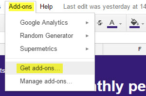
Next, search for and install the Google Analytics spreadsheet add on for Google sheets. This will enable you to retrieve data from any Analytics properties you have access to from the Google account you are using Google sheets on.
Step 2: Generate a New Report
The first thing to do once the add-on has been installed is create a brand new report. This will allow you to specify the analytics property (and view) that you’d like to report on and choose which metrics and dimensions to base the report on.
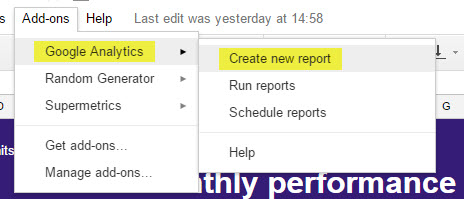
At this stage, there’s no point spending time customising your report metrics and dimensions. This is because once you’ve clicked the ‘Create Report’ button, a Report Configuration sheet will be generated, which you can use to modify the settings of each report you’d like to create in far more detail.
Step 3: Specify PPC Metrics & Dimensions
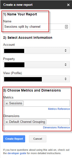
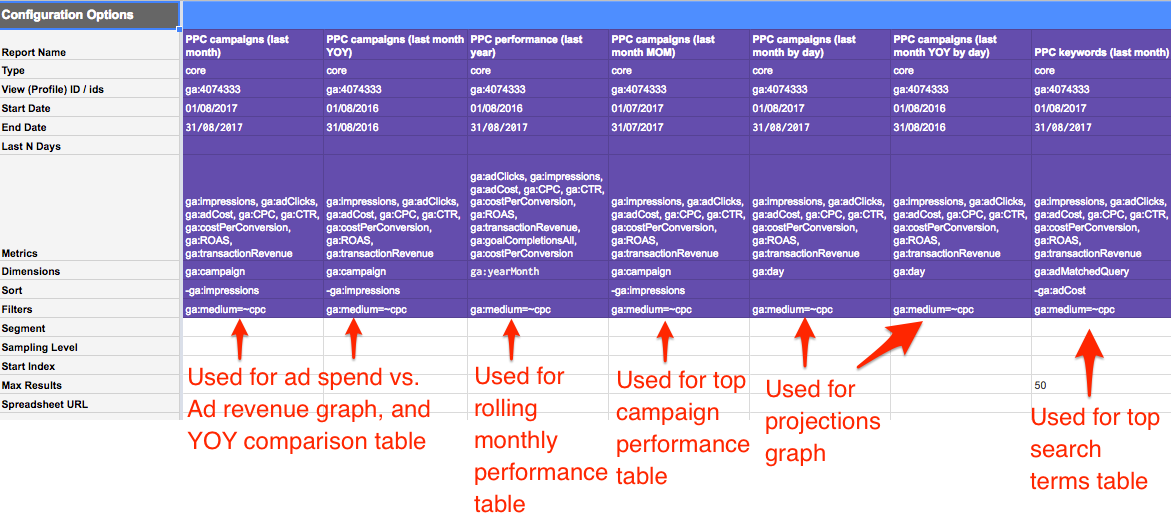
To configure a PPC specific report, you need to visit the report configuration sheet. I have provided an example of the report configuration sheet below, which we have used to set up a range of PPC specific reports (separated by columns):
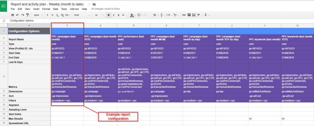
There are six mandatory fields you need to complete in the report configuration sheet:
- Report name – each report must have a unique name.
- Type – set to (core) by default.
- View (profile ID) – Google Analytics view ID.
- Start/end date – can be set manually or via date formulas.
- Metrics – see reference guide for all available metrics.
- Dimensions – see reference guide for all available dimensions.
The remaining options are available to enable data sorting, segmentation and filtering, and to set the maximum number of results returned within each report.
Step 4: Create a Set of PPC Specific Reports
You can create Google sheets reports based on any data collected by Google Analytics, but for this post I will focus specifically on the creation of a PPC monthly performance dashboard.
If you have successfully linked your Google AdWords and Google Analytics accounts, a PPC report can easily be generated based on your Google Analytics data to display the following information:
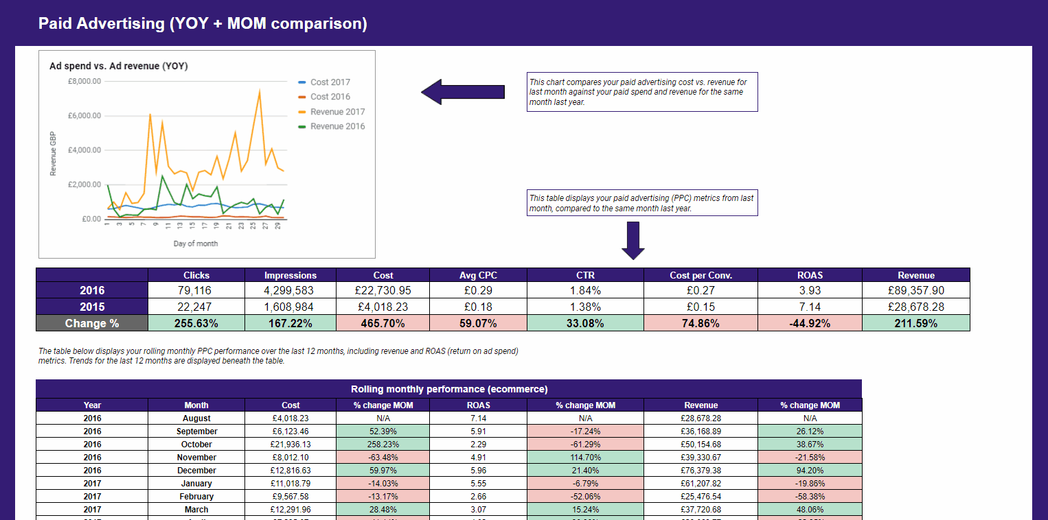
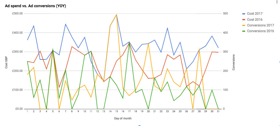
- Ad spend vs. ad conversions (or ad revenue) compared YOY:
- Clicks, impressions, cost, average CPC, CTR, average cost per conversion, ROAS (return on ad spend) and revenue (or other conversions) via paid search vs. YOY:

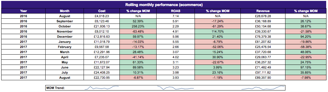
- Rolling monthly performance for the past 12 months for metrics such as cost, ROAS and revenue, including % change MOM for each metric:
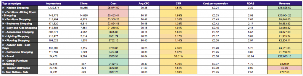
- Top campaigns ordered by impressions, displaying clicks, cost, average CPC, CTR, average cost per conversion, ROAS and revenue:
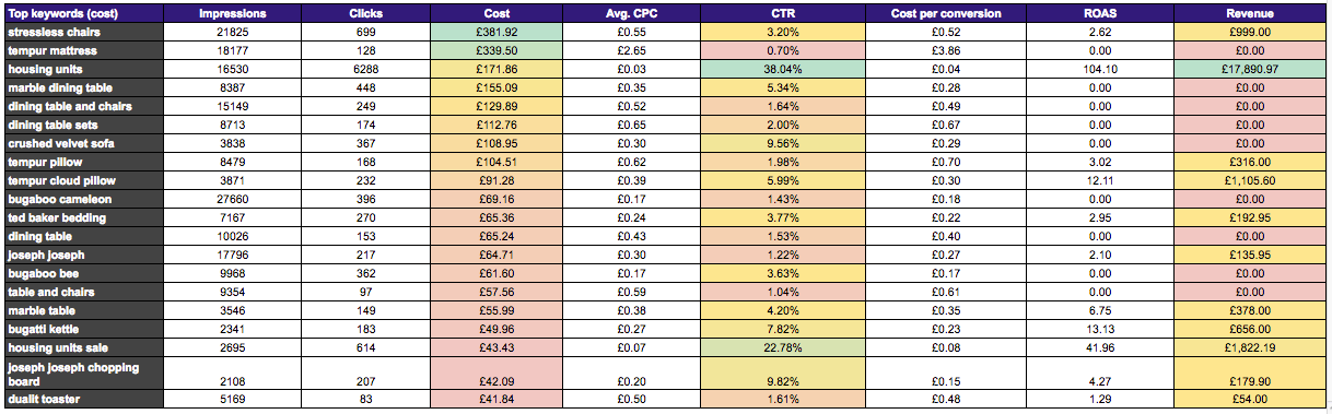
- Top search terms ordered by cost, displaying clicks, impressions, average CPC, CTR, average cost per conversion, ROAS and keyword revenue:
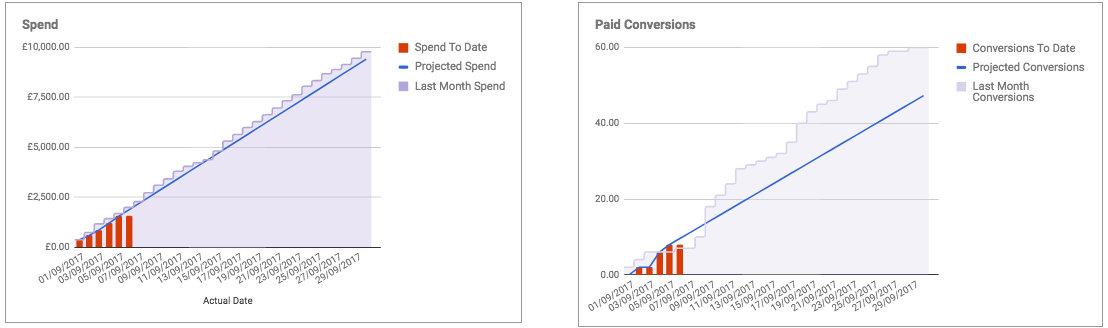
- Projected spend and conversions (or projected revenue) based on historic data:
All the above data can be retrieved by amending your report configuration sheet to reflect the settings displayed below:
Later on in this post, I’ll explain how to set all of the reports to automatically update on a weekly and monthly basis. To ensure the dates are always current, it’s important that the start and end dates of each report in the config sheet (see above) are set using DATE formulas.
In many of the examples listed above, the reports use data for the last complete month vs. the same month in the previous year. To get all the data required to make this comparison, you need to ensure that the end date of each report automatically updates to the last day of the last calendar month. The start date needs to be set 13 months prior to the end date column.
- In the End date column, you need to insert the following formula: =if(today()=eomonth(today(),0),today(),eomonth(today(),-1))
- In the Start date column, you can use the EDATE function, to return the date 13 months prior to the end date (O6): EDATE(O6, -13)
Once your start and end dates match the example report configuration shown above, it’s time to navigate to Add ons > Google Analytics > Run reports.
You will notice that each report (column of the report configuration sheet) is displayed on a new sheet without any formatting. To visualise this raw data, you must now create a dashboard tab to reference the data generated by each report, so it’s easily digestible via a single sheet.
Step 5: Customise Your PPC Dashboard
Comparison Tables for Key Metrics
To create tables to display PPC metrics vs. YOY, top campaigns and top keywords, simply create a heading describing each of the reports and add relevant column headings as displayed in the examples below.
You’ll then need to reference the cells containing the data in the individual raw data sheets you have just generated after customising your report configuration sheet and clicking ‘run reports’.
To add YOY comparisons as shown in the first table, use the formula below, format the cells as percentages, and add conditional formatting rules to display positive (green) and negative (red) performance:
- For YOY comparisons: =(CURRENT MONTH-YOY)/YOY
Rolling Monthly Performance
To create a rolling monthly comparison report, create a table with a row for each month (13 rows in total) in the final 2 row headings (in this example – August 2017):
- In the month column: =text(date(year(today()-1),month(today())-1,1),”MMMM”)
- In the year column: =text(date(year(today()-1),month(today())-1,1),”YYYY”)
To auto-fill the months prior to August 2017 as shown in this example, the formula was rolled backwards from the most recent month by changing the “-1” to “-2” for two months prior. This was done all the way back to “-13”, to give the current month and 13 preceding months.
You can generate the trend lines beneath each section of the chart by using sparklines referencing the date in each column.
YTD Revenue and Projections
To create the spend, conversion and revenue projection graphs you will need to utilise the FORECAST function for the month ahead. This is based on the previous months’ (or years’) performance.
To create a chart to represent this data, like those listed in the examples above, you need to create a table in a blank sheet that displays your forecast data beside your month to date and comparison data. You can then select all three columns and insert a chart via the insert menu:
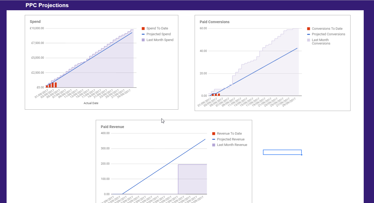
These projections can be particularly useful for ensuring spend is on track, and for spotting months in which performance (conversions or revenue) isn’t projected to be as strong as the comparison period. This will enable you to jump in and rectify any issues before it’s too late.
Ad Spend vs. Ad Revenue YOY
To display ad spend and ad conversions (or revenue) for the current month vs. the same month YOY, select the relevant data within the individual report sheets and create a line chart using the create chart function:
Step 6: Automate and Share Your Report
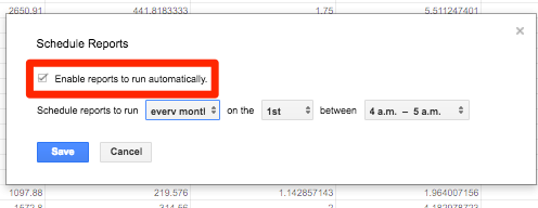
To automate your reports, navigate to Add ons > Google Analytics > Schedule reports and enable the reports to run at intervals to suit your requirements:
Before you share the report, I recommend hiding the report configuration sheet and any of the individual sheets displaying raw data, so you only leave your dashboard visible.
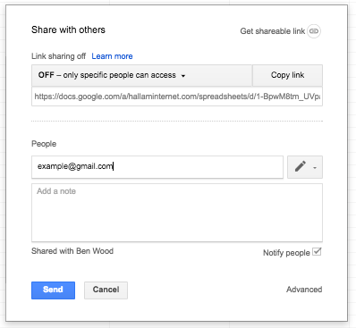
You can then enter the email addresses of anyone you’d like to be able to view your report using the sharing settings tab. The people you share the report with will need to have a Google account too.
Conclusion
Once you have set up your PPC performance dashboard and got to grips with the Google Analytics add-on and its associated metrics and dimension references, you can move on to create similar sections to display a range of other data. This can include organic performance data and email campaign performance, as well as data from other sources such as Google search console and Mailchimp.