
Why is mobile so significant in 2018?
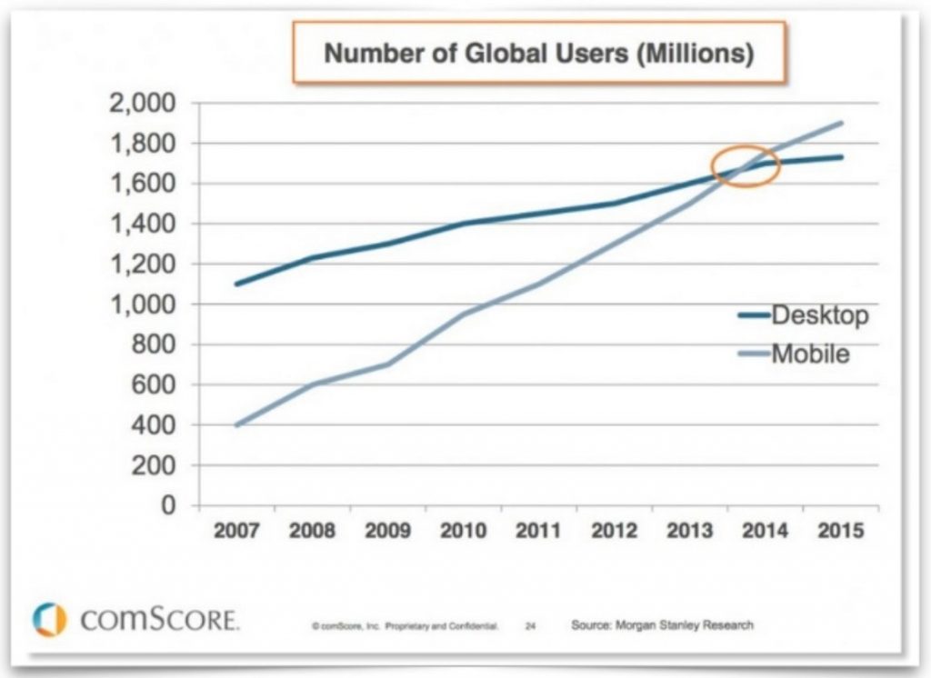
Google announced in March 2018 that they were starting to migrate sites that follow best practices over to the mobile-first index. Google has been pushing companies to focus on mobile for several years now, and this is the latest incarnation of that focus. Mobile usage is growing and mobile searches have long since overtaken desktop. We can see Google constantly trying to future-proof.
More and more, Google is keeping their users within their search results, and this is even more the case on mobile where above-the-fold is dominated by the Knowledge Graph, apps, shopping/topic carousels, business listings, and so on. Google understands the need to focus on mobile, as it’s driven by their users and the kind of content they want to access on mobile and other devices. Ultimately, Google wants to provide the best possible search results that cater for a mobile audience.
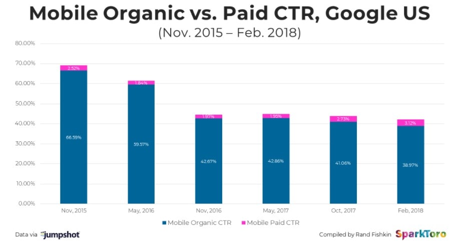
Alongside this, some really interesting data released by Jumpshot and interpreted by Rand Fishkin highlights the effects that the growth of mobile has had on organic click-through rates from the SERPs. In the graph below, you can see how much the mobile CTR has reduced over the past couple of years, indicating that it is getting more and more difficult for sites to gain clicks on mobile. Rand suggests that this is partly due to Google working hard to be an “answer engine” on mobile, far more than a “search results list”:
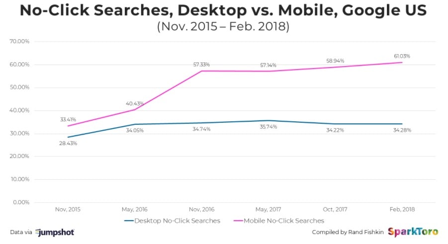
This study also found that there has been a significant increase in the number of searches on mobile which result in no clicks, i.e. Google solving queries within the results:
What does all this mean for SEO?
Rand argues that this data shows that we’ll need to think more carefully about how to influence searchers in Google without earning a click, which he calls “On-the-SERP-SEO”. Particularly when it comes to mobile, we need to focus less on getting click throughs to our websites and more on how we can best utilise Google’s on-the-SERP opportunities where relevant to our brands/businesses.
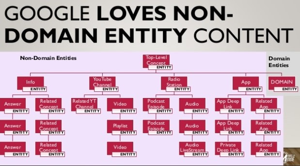
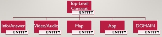
Cindy Krum, at the recent Inbounder conference in Madrid, stressed that we need to keep in mind that Google doesn’t just want to index websites, they “want to organise the information of the world”, whether that’s with direct answers, apps, PWAs, business listings, and so on. More and more, we should be focusing on rich content that is relevant for voice search and can be utilised with or without a screen, along with content which is not necessarily domain or URL based. The days of long lists of search results are, in her opinion, numbered. Below are some examples of non-domain entity content that Cindy highlighted:
Cindy summarised this theory as “entity-first indexing”, with domains existing within a relational hierarchy:
This is a new way to think about mobile-first indexing and I would recommend you read Cindy’s extremely insightful post here, which helps to put this into further context.
So, how should you optimise for mobile in 2018?
All this theory is interesting, but what should you be doing in practice right now to optimise your website and also ensure that you are keeping ahead of the game when it comes to providing the type of entity-related information that Google wants to display in their mobile results?
In reality, this breaks down into two areas: how to gain coverage within the mobile SERPs and how to rank better in mobile listings. Here, I’ve listed some of the key steps you should take to begin putting your mobile-first strategy in place:
- Ensure your site provides an excellent user experience on mobile as well as desktop – you can use the mobile usability report in Search Console which reports any potential issues. Analyse your data to see where the bottlenecks are within your site journey. These tend to occur when users have to wait a long time for a site to load, when content is simply too long to read on a smartphone, or when they have to pinch and zoom to read text.
- Page speed is hugely important, especially on mobile. Use Google’s mobile speed tool to test how fast your site is on mobile, and their domain comparison tool to see how you measure up against competitors.
- Find out what kind of mobile results are displaying for your particular industry and keywords/phrases, then optimise for those results. A simple example would be, if you are a local restaurant, then ensure you have a fully optimised GMB listing.
- Discover the rich results and snippets that are appearing beyond the standard blue link. They may include a carousel, image or other non-textual UI elements.
- The key next step will be to thoroughly implement structured data. Google has been pushing for webmasters to mark up their sites with structured data for a while, and this links back to Google’s semantic understanding of “entities”. Ideally, use JSON-LD.
- Focus on gaining featured snippets by comprehensively answering the questions that your target audience are asking. Find more info on how to optimise for featured snippets here and aim for position zero! STAT have also released some very recent research on the appearance of double snippets (two snippets appearing on the same SERP), so it looks like Google’s experimentation in this area is only going to continue to grow.
- If you are a publisher, online stores, or news outlet, you will want to consider creating a PWA (Progressive Web App) – all the best characteristics of a native app while living on the web. Find out more about the benefits of PWAs here. PWAs have also recently become available on iOS.
If you haven’t already, it’s definitely time to start focusing on your mobile SEO strategy. You need to ensure you are taking advantage of the opportunities offered by the mobile SERPs and that your company or brand’s online presence is staying relevant to Google’s evolving index.
