
Online forms can serve a variety of purposes. Whether it’s signing up to a newsletter, registering an account with a website, making a purchase, or just an enquiry, we’re now used to filling out the required information.
However, a bad experience with an online form can prompt users to abandon a task completely, and go to another website.
With the ever-increasing use of mobile sites and Google’s recent mobile-friendly ranking algorithm update, creating user-friendly forms for mobile devices is more vital than ever. I’m sure we can all relate to becoming extremely frustrated trying to fill out a form on our phone that just isn’t usable on that device!
Here are our top tips for creating user-friendly online forms for both desktop and mobile, to avoid losing any of your potential customers at the last hurdle of the conversion process:
1. Layout
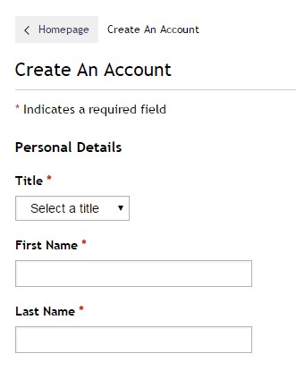
It may seem obvious, but using a clean and simple layout for your online form will make the customer journey as smooth as possible, and encourage more people to fill out all of the information. Vertical layouts, like this example from House of Fraser, are more user-friendly:
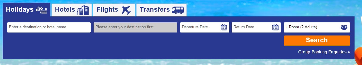
But horizontal layouts can also work, as in this example from Travel Republic:
The key is to keep it simple and to use as few fields as possible to capture the information you need.
For mobile users, this is particularly important. Users will be much more likely to abandon the form if it takes too long to complete.
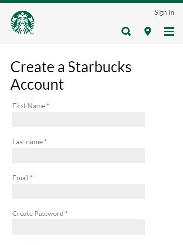
Starbucks have a good example of a clean, simple, vertical form to create an account on their mobile site:
Removing any of the normal navigation options from your online form will also help to keep it clean and simple. For example, Fortnum and Mason have removed their menu from across the top of the page and replaced it with a ‘Secure Checkout’ banner on their checkout options page:
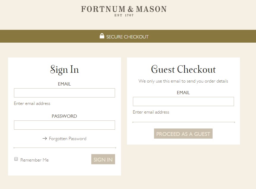
This not only keeps the form clean, it also prevents users from jumping back to other parts of the website once they have started the conversion process. Having a guest checkout option is also recommended for e-commerce websites, as Fortnum and Mason have provided. Users may be reluctant to provide all of their personal details to create an account when making a quick purchase.
2. Field labels and input methods
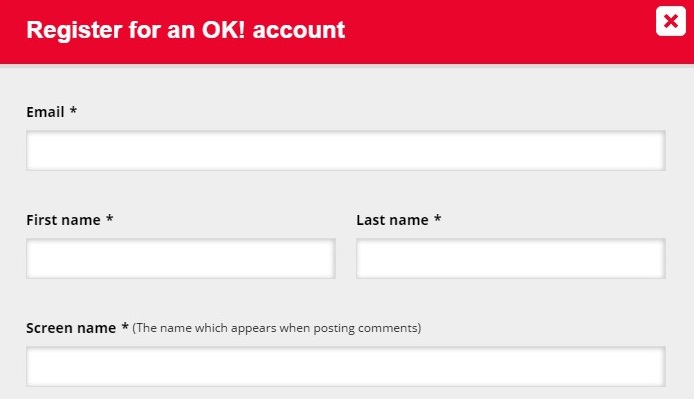
It’s important that the required fields are clearly labelled. Use obvious, recognisable labels to avoid any input errors which could lead to a user abandoning the form. If necessary, include an explanation of the field to avoid any confusion. OK Magazine have an example of this in the “Screen name” field on their online registration form:
Think about the most suitable input method to use for each field. There are various types:
- Type-in fields
- Check boxes
- Buttons
- Calendars
- Drop-down menus
In most cases, it will probably be obvious which method would be best. However, when it comes to mobile forms, some methods are best avoided. For example, the WWF have this form on their mobile site, which presents a few problems for users:
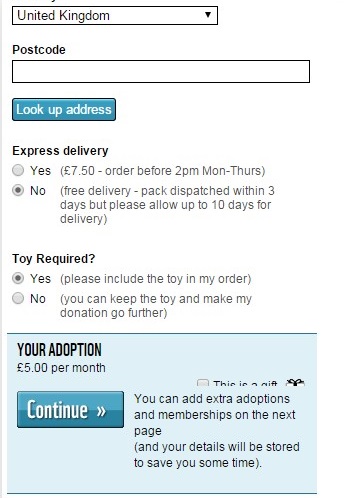
The Yes/No buttons are arguably too small to select easily with your fingertip. As well as this, the ‘This is a gift’ check box in the blue section is almost completely obscured. This form would be frustrating to attempt to fill out on a mobile device.
Expedia, on the other hand, ensures that its calendar input method is large enough for mobile devices:

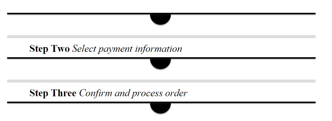
3. Map out the process
If you find that your online form is becoming too long, don’t be afraid to split it across several pages to break it down for users. The key when doing this is to manage the user’s expectations by mapping out the process for them right from the start.
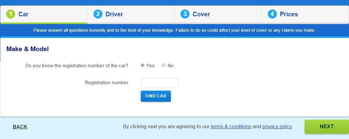
Confused.com has a great example of this, with the different stages clearly numbered across the top of the page:
The Times website presents the different steps of the form in a slightly different format. This is the first page of the form to sign up for an online account:
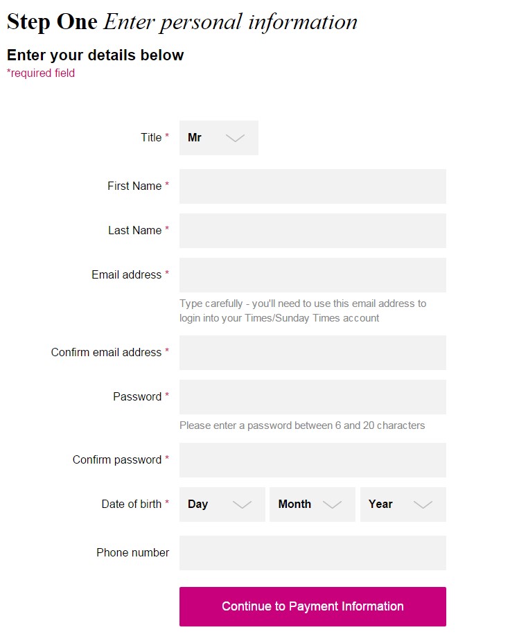
If we scroll down, we can see the next steps:
If the length of the form is made clear to users from the very beginning, they can make an informed decision on whether they have enough time to complete it, or whether they should come back later. This will avoid a problem usually associated with longer forms, whereby users start to fill the form out, only to become frustrated by the length and abandon the task.
4. Be helpful
Similar to the OK Magazine example earlier, Barclaycard has a more detailed example of explaining exactly what information they require in their online banking login form:
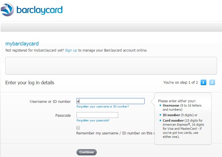
Not only do Barclaycard explain what information they need, they give the user options as to the type of information they can enter. This would be useful, for example, if you couldn’t remember your username or ID number, but you had your card with you and could enter this number instead.
They also provide ‘Forgotten’ options for both of the fields. This is expected as standard across online login forms now, but it is worth noting, as it can be very frustrating if these options are not available.
Another way of being helpful to your users is to be honest about what you’re doing with the information. Virgin Active does this on their online enquiry form:
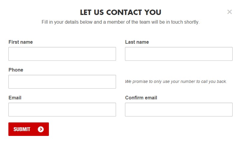
Virgin’s “promise to only use your number to call you back”, although it doesn’t cover what they intend to do with your email address, does offer some reassurance to the user.
Help your users to know that they have completed each field correctly without any errors before clicking the ‘continue’ or ‘submit’ button, with symbols after each box is filled. Very have an example of this on their online registration form, using green ticks and red crosses:
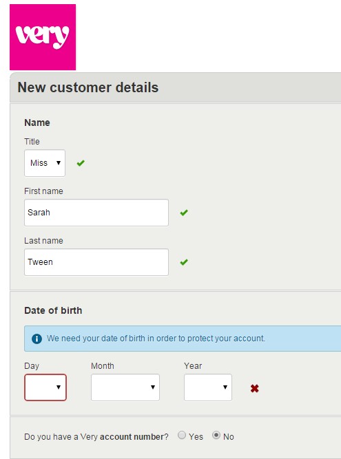
If there are errors, mark these clearly next to the relevant field, perhaps with an explanation of what is required if necessary. This way, users can be sure that the form will be accepted on first-click.
5. Always test!
When creating any online form, always test it yourself on as many devices as possible before launching it. Complete the form in as many different ways as you can to make sure that all of the fields work.
Online forms are valuable tools for your website. Whether it’s to capture data, process a sale, or receive an enquiry, you’ll need a form to complete the conversion.
By this point, you’ve done most of the hard work in encouraging visitors to purchase / sign-up / register etc. Be sure not to let something as simple as an online form stand in the way of that all-important conversion!
