Missed our December Breakfast Briefing? We’ve summarised everything Francis covered in his UX 101 and his personable approach means you don’t need to be the ‘stereotypical designer’ to understand.
UX is just a small part of the whole experience picture. And to understand how to create a good one, we have to take a step back and look at experience as a whole.
Who’s doing it well?
There are lots of great user experiences already out there. Uber is a perfect example – it’s a tech company dressed up as a taxi firm. But it delivers a better experience than a taxi: Uber never makes us get out and go to a cash machine.
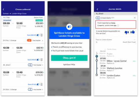
Trainline also delivers a good user experience because a lot of thought has gone into its design. It’s not beautiful, but it’s well thought out and the team behind it understands that the design you see here is just the beginning of your experience.
If you use Trainline in the south, you have to collect your tickets from machines at the station, and sometimes there’s a queue or they’ve stopped working. Trainline have thought about this aspect of their users’ experience, and so the app allows you to buy and use digital tickets. They also know that trains can be busy at times, and that’s why they’ve added a feature that enables users to rate how busy their train is so that other users can see where to get on and which trains to avoid.
 Trainline and Uber both use apps that allow users to buy tickets or book rides and this allows them to deliver a good user experience, but that isn’t enough anymore, because now everyone has a website or an app.
Brands all look the same to consumers; everything is digital and products are comparable.
For example, all companies in the holiday cottage industry have websites, but alone, this isn’t enough to make them stand out. However, Airbnb has modified their user experience to fit the user much more closely, and this is why they’re dominating the industry.
Let’s take a closer look.
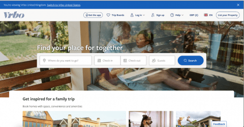
Vrbo is built to convert – it asks where and when you want to go away, and how many people you want to go with, then allows you to search for these filters.
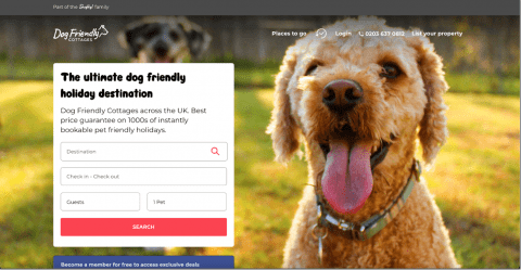
 Dog Friendly Cottages shows people a picture of a dog to make it clear to users that their cottages are dog friendly. Similarly to Vrbo, the website’s main purpose is to convert, again, asking users where they want to go and when, and with how many people.
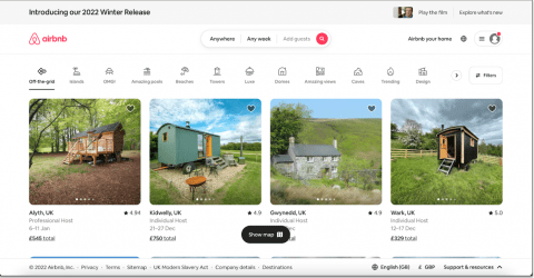
 Airbnb focuses on the kind of trip you want to build for yourself.
They understand the user, they know most people don’t know where they want to go on holiday, but they know they want to have the best experience while they’re there. That’s why Airbnb have designed their site to start the user experience with choosing the kind of trip you want to build, and then helping users decide what that will look like.
 Your most potent weapon going into 2023 is the ownership of the experience your customers have on your site and will have once they’ve left your website or app. If you understand that, you’ll have a great chance of success.
Take a step back
Unless something is natural, it has been designed; from the light bulb in the ceiling to the shoes on your feet, everything is designed for a purpose and a function. Some things are designed well, and others aren’t.
What happens when digital design goes wrong?
There have been a few in-depth studies of user experience that look into this:
- 94% of people do not trust websites that seem to be outdated
- 72% of online shoppers abandon their carts based solely on bad user experience
- 39% of people will stop engaging with a website if the image loading time is too slow
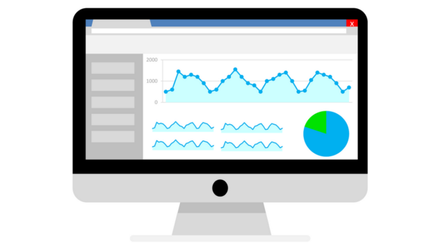
Given the rapid rise in consumer expectations, businesses need stronger design capabilities than ever before.
Only the very best designs now stand out from the crowd, given the rapid rise in consumer expectations driven by the likes of Amazon and social media. With our instant access to global information and the blurring of lines between hardware, software and services, companies need stronger design capabilities than ever before.
When it comes to UX design, most digital user experiences are filled with lots of minor issues rather than a single major issue. Imagine your website like a straight road, and each minor issue is a speedbump. The more minor issues, the more speed bumps, and if you imagine approaching a road full of speed bumps in a car, any practical person is making a U-turn. This same principle can be applied to websites, the more minor issues users encounter, the more likely they are to turn around and leave the site and take the easier route – usually through a competitor’s website.
What can you do to minimise the speed bumps?
When it comes to designing your site, people often have the same questions:
- Do users like having more choices?
- Do they often scroll?
- And do they like to read?
The answer to all of these are – it depends.
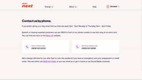
Users want to be clearly guided, so if they want to contact you, they want to be pointing in the right direction – highlighting 10 phone numbers and 3 email addresses to contact won’t help the user, but a clear CTA – like Eon Next’s – and one or two phone numbers gives users a clear and easy instruction to follow.
 In contrast, if a user is on a retail site, they want options! So giving them less dresses to choose from isn’t going to be helpful, but clearly guiding them by grouping all of your products relevantly will be.
Similarly, the amount a user reads or scrolls will be dependent on what the user is looking for and what type of page they’re on. For example, a user is going to scroll for less time on a homepage, and take a lot longer on a blog, and if your user is there to read – like on The Guardian’s site for example – then they will read larger amounts than if they’re looking for a new drill, for instance.
Things like large relevant headings are key to users reading your content and maintaining an interest. Make sure to signpost the things which you think are important to your user.
But, this is all part of the method you will use for your design – first you need to understand your customers mindset and mission.
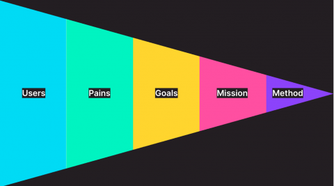
The most important part
Before focusing on what your website will contain, the first thing to remember is the user. Everything always comes back to the user and finding out what kind of person they are.
Users don’t care about your website in isolation – they care about having a meaningful experience. But, how you design your website can help to create this meaningful experience people are looking for.
To do this, you need to overcome 3 major problems:
Problem 1: You’re thinking about UX design
…Which obviously makes sense, considering this blog is about UX 101. But, you need to start thinking about experience as a whole, rather than as UX design in isolation – so which CTAs go where, streamlining your payment system, and a clear hierarchy of information is in fact pointless without the rest of the experience.
To have an impact on your customer, you need to consider the wider picture: the copy, the visuals, the branding. What kind of effect will it have on your user’s experience when all these features are applied in unison?
The answer is: a much more meaningful one that meets your users needs much more effectively.
Problem 2: Users will engage with you on their terms, when they want and how they want
This is not something you can change or control, but you can do something about it by speaking to your users and asking the questions you want the answers to.
There are so many ways you can do this, quickly and for free, too:
- User interviews
- User testing
- Content testing
- Email surveys
- On site surveys
- A/B testing
- Social network crawling
- Customer call listening
Problem 3: Thinking you have a finished design
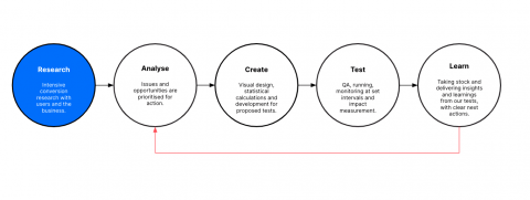
The reality is, design is never finished. The marketplace is constantly evolving and users are always changing – even if you feel your design is perfect, it won’t be in a few months time.
As we mentioned earlier, 94% of users don’t trust websites that seem outdated – to counter this you need to follow a circular process of analysing, creating, testing and learning. And then doing it all over again.
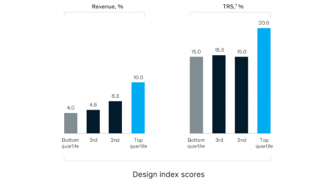
The bottom line: what does your company gain from giving users a better experience?
It’s simple really, better design and experience correlates to higher revenue growth.
There really is nothing stopping you from creating user-centric experiences and designs, and there’s everything to gain.
Want a hand in delivering the best experience to your customers? Get in touch and our team would love to help.