
The word ‘wow’ is cloaked in ambiguity because it can refer to something being very bad, or very good. The term has turned designers cross-eyed for decades but it can apply to any industry at any level.
To find out if the term is valid, we need to examine the main purpose of design. Is a design job done if it makes you say “wow” or is there so much more to it?
So what is the ‘wow factor’?
Wow is generally used when you have a vague idea of what you want, but you’ll only know exactly what it is when you see it. It’s also purely subjective.
That makes it very difficult for a designer, as it creates an infinite playing field. To give the designer a fighting chance of meeting a brief, consider providing them with your vision of ‘the wow factor’ through visual references and examples. Your vision should align with your users’ expectations.
The main reason this term has been buried deep into the big book of web design mythology is because it isn’t a traditional media for marketing. TV advertising, direct mail and the good old days of traditional marketing had to fight for your attention. It had to disrupt you. Websites don’t work in that way. People choose to go to a website so you don’t need to grab their attention by shouting in their face like a burly sergeant major. You need to keep their attention and this can be achieved by offering easy steps to find what they’re looking for.
[panel type=” text-center” ]
The role of design is not necessarily to wow people but to give them a gratifying and meaningful experience that they will remember.
[/panel]
Have you ever been ‘wowed’ by a website?
When was the last time you used a website and said “wow”? Do you say “wow” every time you open Google? Or “wow” when you use MoneySupermarket – well, possibly, if the insurance premiums are extortionate.
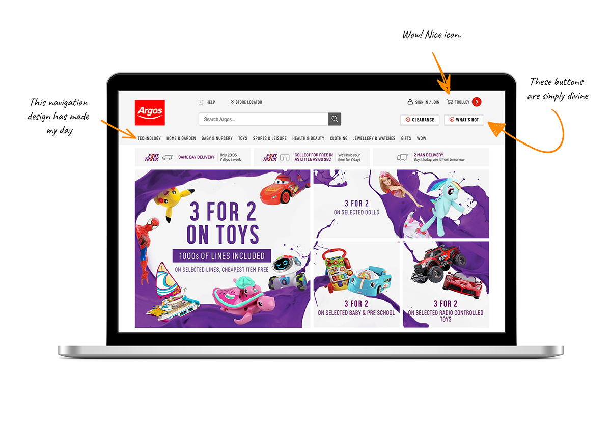
Let’s take a site like Argos as an example.
“Wow I love this navigation”, said no user, ever. Along with “Wow! These buttons are breathtaking” or “Wow! That Trolley icon is simply divine”. Although “Wow! 50% off garden mowers” would be a fairly plausible exclamation by any dad in Britain. Comments like “wow, these garden mowers are presented exquisitely and I like that swoosh effect” are unlikely. They’ll probably only ever be made by designers, not your regular Argos customer.
It’s the content that makes the wow factor – not the way a website is designed. The content can be crafted, the language can be persuasive and the imagery can blow your socks off.
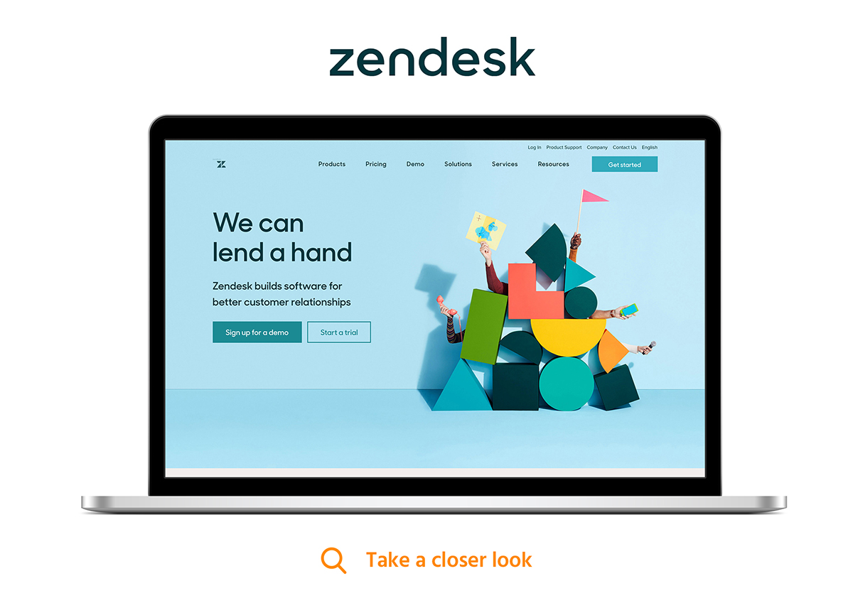
Do these leading B2B websites, in your opinion, have ‘the wow factor’?
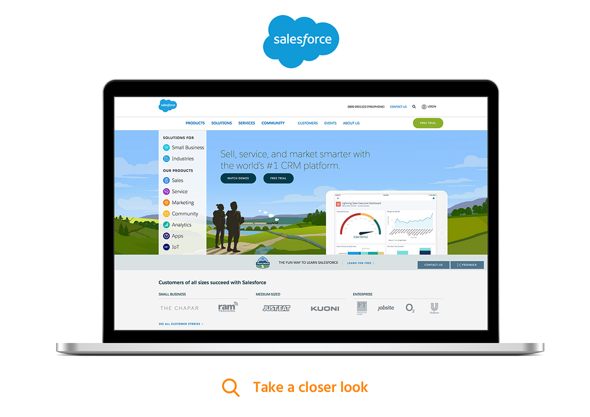
Sites like Salesforce are primed for easy navigation across acres of pages and for converting the right type of leads. There is nothing overly unique about the visual design of the website but the content is packed full of nourishment for users to dive into. They let the innovation of their product do all the ‘wowing’.
Or maybe a design like this will best represent your business and inject some ‘wow factor’.
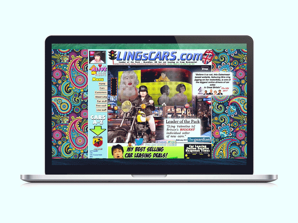
This is what some clients think makes a design ‘pop’. There is one saving grace for websites like Lings Cars – this website gained so much media traction on account of its garish approach, that it has become a UK leader in new car sales. It was no accident. It was purposefully designed this way to provoke a reaction. This is a very individualistic approach, however, without the all-important trust signals, would you buy a car from Ling? This is where the content comes to the rescue once again.
Great Design Is Invisible…and So Is the ‘Wow Factor’
Have you ever noticed that a website starts to feel more like a website when it becomes difficult and frustrating to use.
Digital designers strive for the seamless user experience that captivates the user and makes them feel like the website or app they are using is an extension of themselves. To achieve an experience like that deserves a ‘wow factor’ but it remains hidden to the eye and the conscious mind.
Designing a holistic user experience.
Airbnb has been credited with revolutionising modern user experience, and yet, you would barely notice it.
- Emotional connection
Look at all the smiley, happy people. Emotion is contagious and the product designers at Airbnb have latched onto the fact that looking at photos of happy people passes this emotion onto the user, making them feel comfortable and at ease with the website. The language they use is empowering and rewarding. - Machine learning
Without diving too far into the technical complexity, Airbnb use machine learning to personalise search results for guests and tailor host preferences which promote those most likely to accept your request. They use a predictive pricing model to help the hosts price their rooms based on travel patterns. The sophistication of this technology has given Airbnb an enormous competitive advantage in the hotel industry and it gives the users a flawless experience. That deserves a “wow” I think for sheer brilliance in design and engineering and yet, you would never know about it. You can learn more about Airbnb’s machine learning here. - The little details
Focusing on the detail of each element and each small step made by the user is Airbnb’s strong point. They have removed the pain points from narrowing results by price. A faint graph offers a guide of how many listings feature within each price point. They include social proof to create a sense of trust and urgency when requesting to book. They use a dynamic homepage that shows one version when you first visit the site and another, with all your preferences listed, once you return.
Put your users at the heart of every decision
The next time your lips are pursed and the inner beast is brewing to exclaim “it needs more of the wow factor!” pause a moment to consider your users.
It goes without saying, everyone that has a hand in creating your new website should feel proud of the final product. However, that shouldn’t be at the expense of your target users experience.
At Hallam, we create personas that personify your key target audience groups. It gives us someone to talk directly to and helps steer our decision making. Using personas can remove personal ego and focus on what will give your users the best experience.
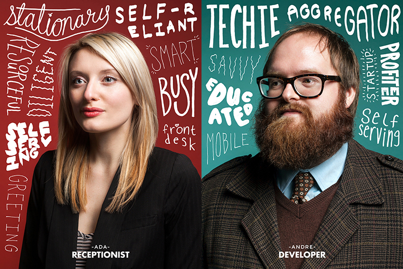
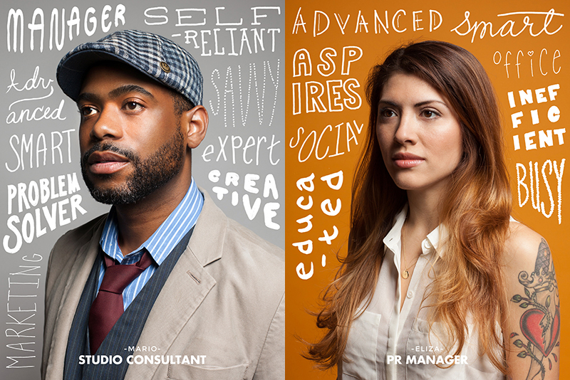
Here are some examples, courtesy of Mailchimp.
Overcomplicating a design in an attempt to ‘wow’
Prototypical design plays on expectation. It’s how your brain groups everything you interact with and turn it into a basic mental image.
Remember Family Fortunes? It works on this same premise. “We asked 100 people to name a colour associated with a baby boy?”. “Blue?” Our survey said ***top answer***.”
Design should initially base itself on popular preconceived ideas of what something represents. So when you veer away from the most popular standards and instinctive mental images of where something should appear on a website, or how it should function, you force users into using more brain power to process how to use it – which can lead to frustration, user error and drop-offs.
This is why websites follow similar patterns and why designers work within these confines.
Let’s recap
- Content is still king until further notice.
‘The wow factor’ is achieved through the quality of your product or service offering – not the way the website is designed. Invest in your imagery and focus on creating persuasive language to get the most ‘wow’ from your website. - Use your branding to add ‘the wow’.
Branding and visual identity supports ‘the wow factor’ and should primarily be used to give your site a personality. If your identity has the ‘wow factor’, it’s likely you’re website will follow suit. When briefing your project, focus on a personality that best represents your business and attracts the right kind of user – good designers are skilled enough to present this through look, feel and tone. - Focus on experience more than aesthetics.
The main role of digital design is to provide a pleasurable and memorable experience. It should be holistic and help the users forget they are using a website. Creating pain-free user journeys in the wireframing process will set your website up for a seamless user experience. - Design for your users.
Put your users or personas at the heart of everything when reviewing design and try to remove personal opinion. That is how designers work to remove personal ego from the equation and consider the wider base of users. - Keep it simple.
Overcomplicating design, trying to be completely different, or changing the wheel in an attempt to ‘wow’ can drastically narrow your user base and reduce conversions. Websites that truly wow using a mix of innovative design and technology will often forgo functionality, usability and purpose in favour of creating a talking point. Simple and usable design will focus the user on the content that your site offers.
Now that you’ve read this post, you’ll hopefully be sickened at the very mention of wow, having seen it over 100 times. Remember that design delves far deeper than aesthetics and a designer considers every aspect of a website in great depth.