Another year has rolled by and, once again, we’re looking back at all that’s happened in the world of brand and identity design, highlighting some stellar pieces of work from across the industry and pulling out some key learnings that you can apply to your organisation in 2024 and beyond…
Timelessness really is, well, timeless
Unveiled at the very start of 2023, the Eurostar Group launched an ambitious new identity that firmly pulled them from the brink of being a forgettable travel provider into a much more versatile, exciting state of being.
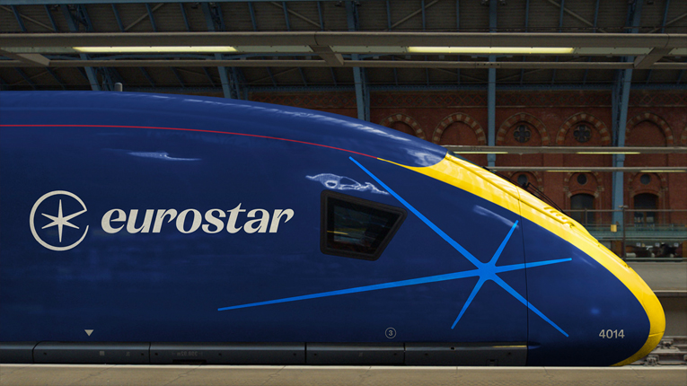
What I love the most about this rebrand is that it feels modern, but also like it’s been around forever, too. In short, it feels timeless.
Visually, the rebrand treads the right balance of nostalgia, called upon by a muted colour palette and flowing typography that simply has a bit more soul than its more “modern” counterparts. What’s truly great about it is that it has a visual language, anchored by its new star/compass icon, that exists comfortably across modern applications such as motion design or small-scale digital instances.
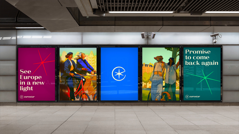
Making your brand look the “newest” in its category doesn’t always lend itself favourably.
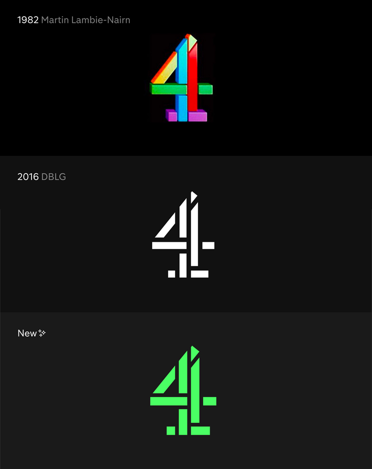
Channel 4’s personality continues to shine through
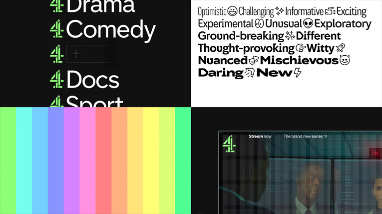
Over the summer, British TV mainstay Channel 4 rolled out a refreshed brand identity that included a pastel-neon colour palette and a quirky take on cubism. However, what stood out most to me was the strategic development of a new naming toolkit and a redefined articulation of ‘4ness’ (Channel 4’s distinctive personality).
The foundation of any thriving brand is a bedrock of brand strategy; something that not only provides a base from which to grow, but also permeates upwards through every decision that brand makes.
In short, Channel 4’s sharpened definition of ‘4ness’ means that both their in-house teams and external partners can make decisions with confidence: if an option doesn’t feel like it exudes ‘4ness’ then it’s not the right option. That solid understanding of a brand’s personality – communicated internally – is what keeps the best brands looking, sounding and feeling the same, everywhere they show up.
If you don’t have a personality, get one
Channel 4’s longevity – and their ability to seamlessly transition from one “era” to the next – should come as no surprise, really. After all, they have an established brand personality that stretches back nearly 40 years.
Let me put it this way: if I asked 100 Brits to describe Channel 4 in three words or less, I’d be confident in saying that I wouldn’t get much deviation from the likes of “bold”, “daring” or “progressive”.
That level of understanding comes from having a distinctive voice in a noisy environment. And it’s a lesson that any brand can apply, no matter your category. If you look or sound similar to your competitors then your prospective customers won’t see any discernible difference between you, so they’ll start looking at things like price – which then puts you in a race to the bottom.
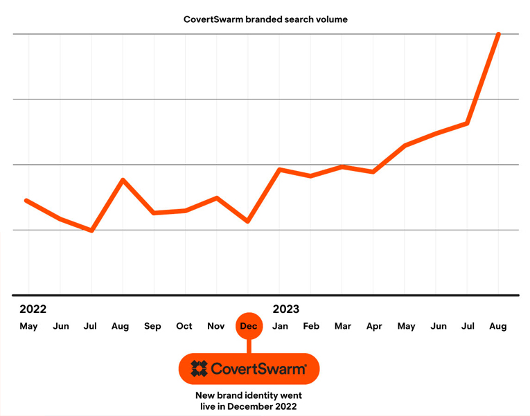
Standout isn’t easy to achieve, but, back in April, we helped relaunch cybersecurity brand CovertSwarm, kitting them out with a bolder, more daring visual identity.
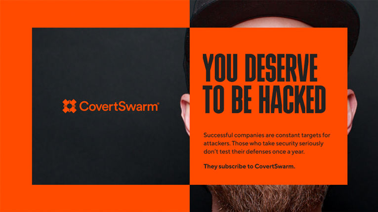
We provided them with messaging frameworks that packed a punch and guidance over important visual elements like typography, photography and graphic devices. The result was CovertSwarm’s branded search volume more than doubling.
Head and heart
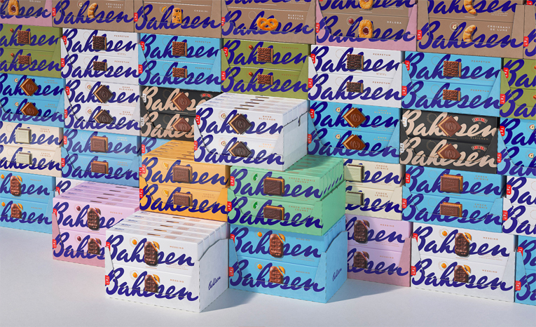
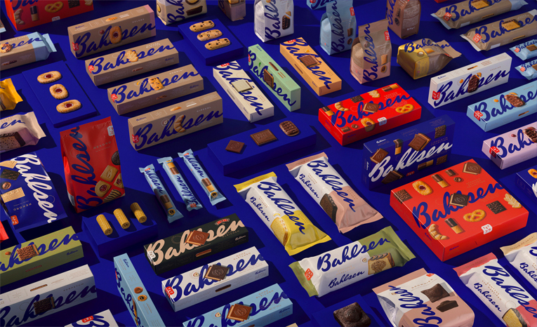
2023 also shone a light on the need for a balance between head and heart decision-making when it comes to brand and design. Enter beloved biscuit brand Bahlsen who – back in 2021 – refreshed their identity to help modernise the brand.
The refresh included top-to-bottom updates to brand assets like their logo and colour palette (both receiving minor – but much needed – adjustments) right the way through to their packaging.
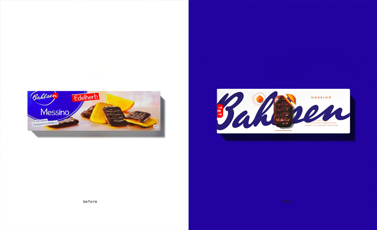
When the refresh was first announced, I was amongst many other brand designers who lauded the change. The level of craft and detail put into the work was exquisite, and the designs were beautiful.
Fast-forward to this year when Bahlsen CEO Alexander Kühnen admitted that “the design is artistic, but doesn’t completely match what consumers expect from the category.”
In short, Bahlsen is falling behind in the German confectionery market and the brand has pinpointed their newlook packaging as partly at fault. It begs the question as to whether or not enough consumer research/testing was conducted to fully understand what equity might be lost as a result of the new designs.
Sensibly, the brand appears to have avoided panicking and reversing their decision entirely and are instead focused on understanding what they need to do to fix things. Kühnen continued: “It was a bold statement, but not sufficiently consumer-oriented. The next step will be another bold one, but it will have to be more consumer-focused.”
It just goes to show that, what might look wonderful to one person, might be off-putting to the people you actually want to engage with. I’m not saying you should design by committee, or that you should let every decision be governed by what your target audience wants to see (how can you break new ground by doing that?) but every brand needs to find a good balance between head and heart when it comes to making big decisions.
Renewables are getting sexy
I’ve been saying for nearly 15 years that the only way we’ll ever properly protect our planet is by making it profitable to do so. And a huge piece of that puzzle – at least to my designer-brain – is that we need to make green businesses more enticing, not just as business opportunities but as something to get excited by.
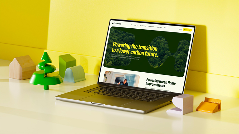
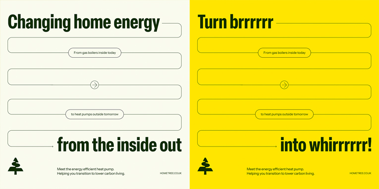
So when Hometree announced their new brand identity in September, I started to think that maybe we’re approaching that point. When a brand that offers ‘boiler insurance and helps residential customers transition to low-carbon living’ can look and sound as good as this one does, I think we’re heading in the right direction.
It’s only a matter of time before we start seeing frontrunner brands in green categories. Renewable energy, sustainability consultants, eco-construction, waste management, green foods and travel will all see a clear hierarchy start to emerge, and the strongest brands will be at the forefront of their respective areas.
It’s refreshing to not only feel hopeful for 2024 and beyond, but to be actively excited by all that’s yet to come.
Interested in this years’ learnings or hoping to build a memorable brand in 2024? Let’s chat.