In a world where attention spans appear to be getting shorter by the day, the way in which content is laid out on your website goes a long way in keeping users engaged.
Whilst your website design should consider and optimise UX (user experience) with every move, it’s not solely responsible for how users interact with your site.
What Is Content Mastering?
Content mastering is what we call the process of optimising the content of a website by using visual aids to break up the content, make it more readable and ultimately, keep the user engaged long enough for them to make the all-important jump from users to leads.
Below are some simple tips which will help to improve UX through content mastering.
1. Images
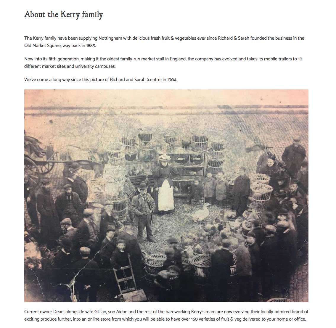
One of the easiest and simplest content mastering tools, is using images to break up content and these can also help to illustrate the point you are making. This can be especially useful for content-heavy pages such as service or sector pages.
For extra weight, I would recommend hiring a professional photographer for a ‘lifestyle’ shoot to illustrate the key parts of the business. Stock photos can be a good source of inspiration, but there’s one big problem with stock photos: they look like stock photos.
Besides, people like to see first-hand the service they’ll be getting and the people offering it, especially if it tells a story.
2. White Space
It may seem like you’re adding dead space to your website, but using white space actually makes the content more easily readable.
White space gives the user’s eyes time and space to breathe, rather than having to work through a large amount of text.
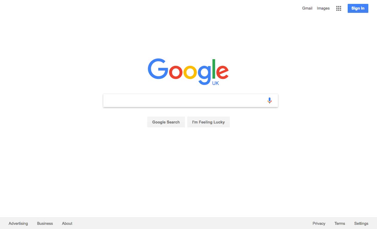
It can also help to make the important elements of the page stand out more. One example of this we’re all familiar with is Google’s homepage.
Google has one main action (the search bar), but there are also a few secondary actions such as links to Google Images, Gmail, account sign-in and legal and company-centred links. Didn’t notice those? That’s because Google puts these links in the header and footer, rather than in the body of the page, and uses white space around the search box to draw all of your attention to that specific action.
3. Headings
Another very simple content mastering tool is to use headings and sub-headings to break content into smaller, more readable chunks.
Studies have shown that web users read in an F-shaped pattern. The use of headings and sub-headings to denote sections of content helps users to read more quickly and easily in this way.
4. Bullet Lists
Bullet lists are a very effective tool as they provide only the most vital information. Bullet lists can make perfect sense without needing to be complete sentences.
This helps to prevent the user from becoming overloaded with information they don’t need, and reduces the likelihood of them leaving the page in favour of reading too much content (remember those attention spans).
5. Icons to Denote Actions
Icons can be used to draw the user’s eye to an action. If the right icons are used, they will also tell the reader what the action is, before having to read any instructions.
For example, if you use a ‘play’ icon, users will know that this action will play a video before reading to find out what the video is.
![]()
In a nutshell, good user experience is about more than just layouts and visual design. With a few simple content tricks, you can make your website more usable and more importantly, improve conversions.
On-page content is also a key component in user engagement. Find out how to write compelling content in our blog post on how to write quality content.