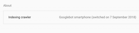
Google announced in March 2018 that they were starting to migrate sites over to the mobile-first index – we noticed with our clients that for the most part, it was actually more like September 2018. On 1st July 2019, Google switched over to mobile-first indexing as the default for all new sites, some legacy sites are still being moved over. You can check when your site was moved over to the mobile index by looking in your Search Console account and selecting ‘Settings’, see below.
Prior to this announcement, Google had been pushing companies to focus on mobile for several years, fair warning that something drastic was coming for those who didn’t heed it. Mobile usage has grown year on year and mobile searches have long since overtaken desktop.
So what does it mean to be mobile-first and what is the impact on SEO? Well, Google’s mobile-first index essentially means that the mobile version of your content is what the search engine uses in order to rank your site. Therefore, if your mobile experience is poor, you should expect rankings to suffer. Websites built over the past couple of years should have been built with the mobile experience front and centre of the design in order to futureproof and capitalise on the prospective ranking rewards.
Google is consistently showing that they want users to stay within the results, or at least click an ad instead of an organic listing – they are a business after all. This is amplified on mobile devices, where the precious, above-fold real estate is dominated by paid ads, the Knowledge Graph, shopping feeds, rich snippets and so on. But ultimately, Google understands that mobile users are the majority of their market and it is vital to the continued growth of the search engine that it serves results which provide a seamless mobile experience. To keep them on top, Google must provide the best possible search results and search experience for a mobile audience.
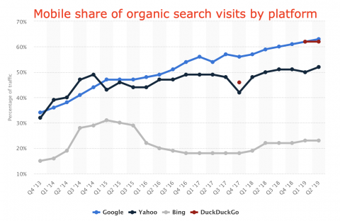
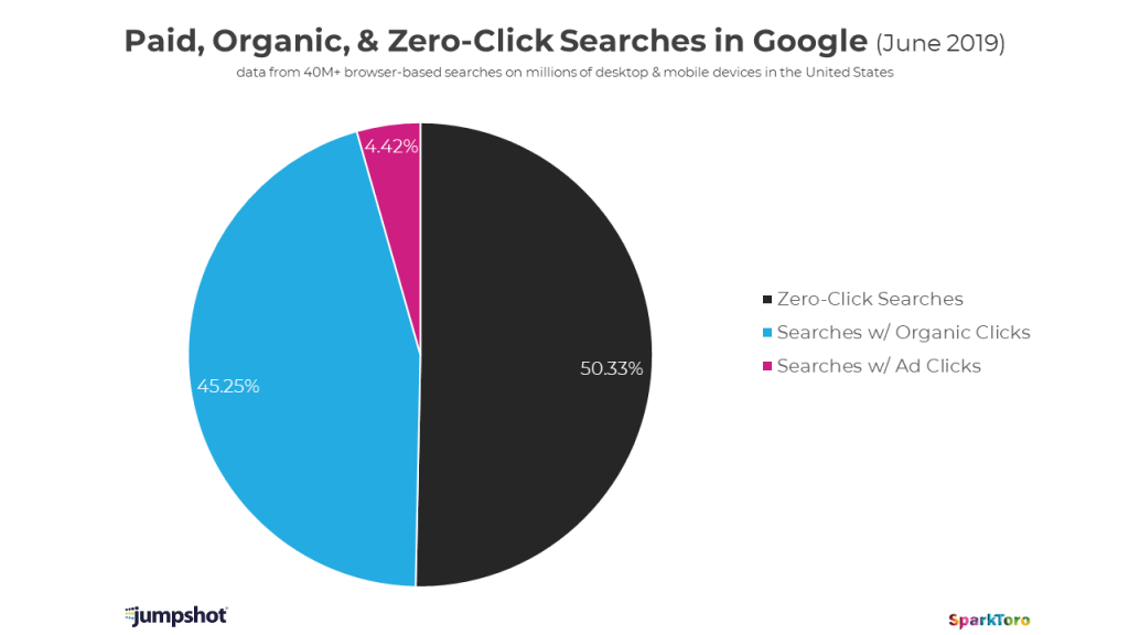
In 2018, some really interesting data released by Jumpshot and interpreted by Rand Fishkin highlighted the effects that the growth of mobile has had on organic click-through rates from the SERPs. In the graph below, you can see how much the mobile CTR has reduced over the past couple of years, indicating that it is getting more and more difficult for sites to earn clicks on mobile. Rand suggests that this is partly due to Google working hard to be an “answer engine” far more than a “search results list”. This study also found that there has been a significant increase in the number of searches on mobile which result in zero clicks, i.e. Google solving queries within the results.
What does this mean for SEO?
Simply put, if your site isn’t mobile-friendly, then your SEO efforts may fall at the wayside. Your digital marketing strategy must include building a mobile-friendly site or retrofitting your current site to perform better on mobile. There are a number of ways of doing this. The preferred method is to create a ‘responsive’ site that is able to change the way its pages are served depending on the device used to access them. In a world of ever-changing devices sizes and formats, this is the obvious choice for longevity.
Another way is to make your site ‘adaptive’, where a number of layouts are created for different device sizes and the closest layouts are served depending on the devices used. This is a less flexible way of serving mobile content and could mean that you aren’t always presenting your best self to mobile users.
Responsive on the other hand is more technically tricky to implement, but means that only one version of your site is queued up to be shown, instead of a selection of different layouts. This results in a smoother, quicker experience and one that is more tailored to the device that’s accessing the site.
Google has published guidelines on preparing for mobile-first indexing, which are really useful and provide some best practice tips to help website owners understand the changes they may need to make, such as:
- The mobile site must contain the same content as the desktop site. This includes structured data and meta tags. If you have no mobile version or your site is responsive, the content will be the same anyway.
- Verify both versions of the site in Search Console to ensure you’re able to see all the data available. Again, this is only necessary if your mobile version is separate from your desktop site.
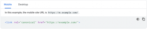
- If the mobile version of your site is on an ‘m.’ url, it should contain canonicals that point to the desktop site to avoid any duplicate content issues. An example of how this would look is below.
To learn more about Google’s suggestions and guidelines for mobile-first indexing, click here.
How to optimise your site for mobile-first indexing
1. Provide an excellent user experience on mobile as well as desktop
Use the mobile usability report in Search Console, which reports any potential issues, or the Mobile-Friendly Testing Tool. Analyse the data to see where the bottlenecks are within your site journey. These tend to occur when users have to wait a long time for a page to load, when content is simply too long to read on a smartphone, or when they have to pinch and zoom to read text or see an image.
2. The faster your site, the better
Page speed is hugely important, especially on mobile. The likelihood of a user bouncing rapidly increases when experiencing a slower load time. Previous research has shown that 53% of mobile users will leave if made to wait more than 3 seconds. Use Google’s Page Speed Insights speed tool to test how fast your site is on mobile and desktop, and their domain comparison tool to see how you measure up against other sites in your industry.
3. Track and observe mobile SERPs as well as desktop
All good keyword rank trackers allow you to track both desktop and mobile rankings of your keywords. You should also routinely check your verticals on mobile for rich snippets, local packs and other SERP features. That way if something changes or you notice certain keywords ranking better on mobile you can make changes and optimise accordingly.
4. Ensure your site makes full use of all the structured data mark up opportunities available
Google uses the information within your structured data to better understand your content in order for it to serve said content within rich snippets and other SERP features. Check the schema.org site regularly to stay on top of the types of structured data available to you. Beware of incorrect or spammy usage though, follow best practice and Google’s own recommendations to ensure you stay away from penalties.
5. PWAs might be your new best friend
If you are a publisher, online store, or news outlet, you might want to consider creating a PWA (Progressive Web App) – all the best characteristics of a native app while living on the web. They offer extra user functionality such as offline access and push notifications. Find out more about the benefits of PWAs here.
6. Consider implementing AMP, especially for news & blog posts
AMP, or Accelerated Mobile Pages, is a way of stripping back and serving lightning fast content to mobile users. It was developed by Google to address the world’s growing need for speed. Read more about AMP here.
Summary
Hopefully, you now have a better understanding of mobile SEO, mobile-first indexing and how it impacts your wider SEO efforts. As digital marketers, it’s imperative that what we serve satisfies the needs of modern searchers and that we stay on top of developments to prepare ourselves for future users too.


