

Need a refresher on Core Web Vitals? Learn what they are and how to optimise for them in my Core Web Vitals Explained article.
Automated monitoring of CWV metrics
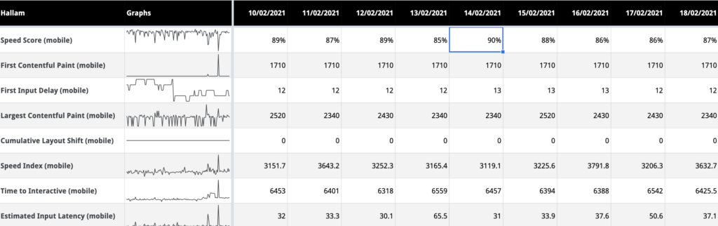
If you have several websites or key pages you want to monitor over time, without having to manually run test after test, this spreadsheet by Digital Inspiration could be for you. Just grab a Lighthouse PageSpeed API key, plugin some URLs and away you go!
The spreadsheet helps identify potential performance issues around key CWV indicators and when they might have occurred, which can in turn give us clues to what might be the cause. It can also be used to demonstrate how speed scores can change naturally over time as a website grows, or when changes to the underlying page speed algorithms are made.
We’ve been using a modified version of this spreadsheet for a few months and it has helped us identify opportunities to improve the performance of a number of websites.
PageSpeed Insights
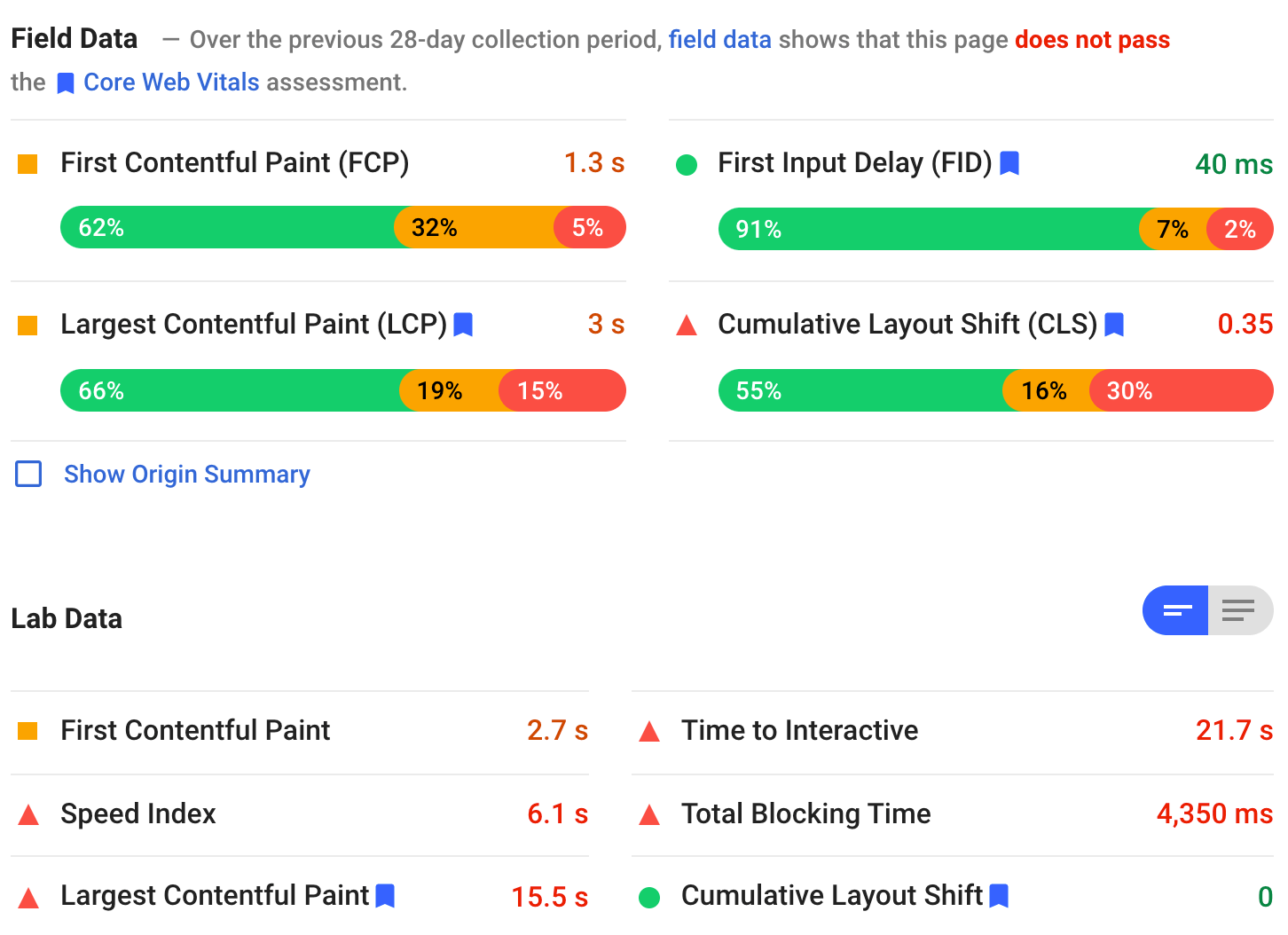
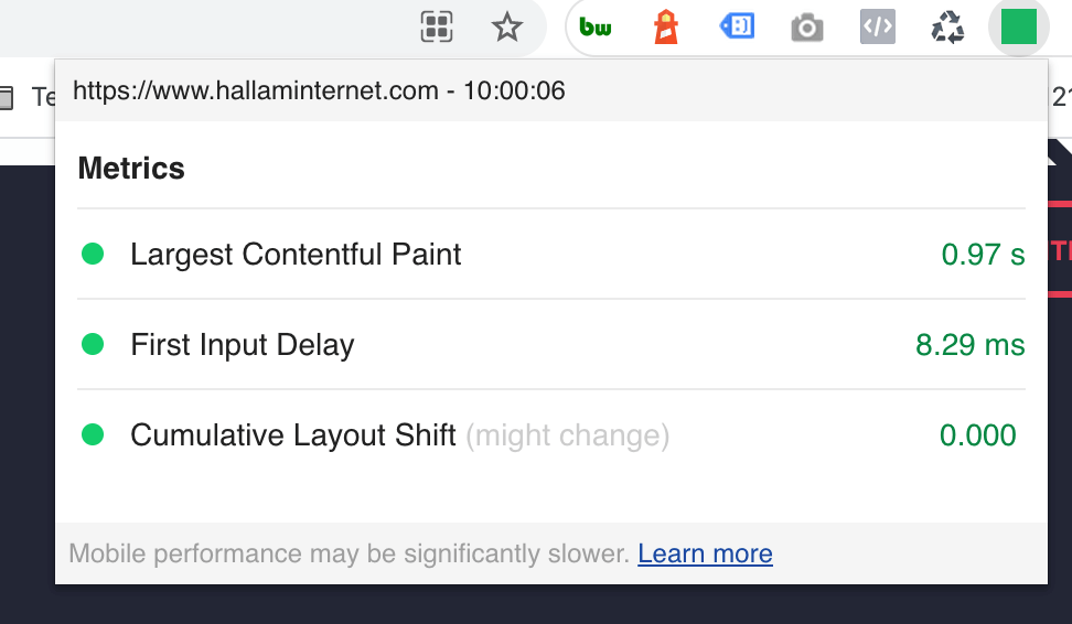
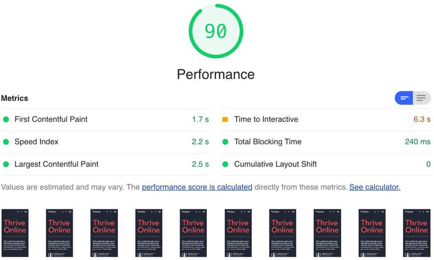
Google’s PageSpeed Insights is my go-to tool for initial, top-line investigations into performance and CWV related issues, for both mobile and desktop devices. Reports contain ‘Field Data’; how real-world users experience the website along with Lighthouse ‘Lab’ data that simulates a page load, which is useful for repeatable and consistent testing.
Core Web Vital metrics are clearly highlighted with simple, colour-coded indicators. Poor metrics are highlighted in red, good in green. These metrics are combined to give an overall speed score, and you need 90% or more for a green ‘pass’.
A series of recommendations and diagnostics are also given in these reports, ordered by the highest impact items in terms of total seconds that can be saved.
Chrome DevTools Performance Monitor
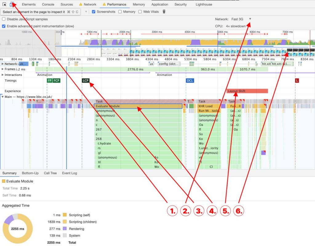
For a more detailed analysis of performance and CWV related issues, I often turn to Chrome’s Performance Monitor within DevTools and some of the key CWV indicators I use are numbered in the screenshot below.
- First up, you’ll want to make sure you’re running the performance monitor at the correct resolution, as LCP and CLS elements will often change at different resolutions. I have mine set to 350 x 636 pixels to replicate the PageSpeed Insights mobile view.
- Before running the report, you may also want to simulate the connectivity and power of a mobile device. I often select Fast 3g and 4x CPU slowdown.
- Selecting the LCP metric once a report has generated identifies what the largest element is. This should be as close to the FCP (First Contentful Paint) as possible. If there’s a gap, you’ll want to identify and streamline the delivery of the largest element.
- Long CPU tasks are highlighted by the red diagonals on the grey bars. This is often caused by heavier JavaScript, represented by the yellow bars and will affect your interactivity metrics (FID, TBT and TTI). Drilling down the bars below will usually point to the offending JavaScript files and functions.
- Layout Shifts are highlighted by these red bars and selecting them will usually highlight what element has been shifted. A large amount of these will create higher CLS values.
- The frame view can be a great way to visually highlight how content appears and layout is shifted as it is loaded in. For high CLS values, it is often obvious from the frames what the cause is. In this example, a large cookie banner causes the layout shift as content as pushed down.
Web Vitals Chrome Extensions
Core SERP Vitals
The SERP Vitals extension displays a handy indicator for the LCP, FID and CLS metrics direct in search results. It’s great for competitor analysis and can give a quick indication of how fast a web page is likely to be before you visit it.
Data is compiled anonymously from real users by the Chrome User Experience Report (CrUX). It’s not available for every site, however, as new sites or sites with little traffic will not have garnered enough data points.
Web Vitals
The handy Web Vitals extension measures the 3 key CWV metrics for desktop users in Chrome in real-time, and its traffic light colouring provides a quick indicator as you browse through a website. As it doesn’t rely on externally gathered user data, it can be great for developers working in a local environment to catch any issues early on.
Lighthouse
The Lighthouse Extensions provides a quick route to the same reporting feature available within Chrome DevTools and pulls in Lab Data using the Lighthouse API rather than Field Data from real-world users through CrUX.
The performance report is very similar to PageSpeed Insights mobile analysis, giving similar diagnostics and recommendations. Additional reports are also generated for SEO, Accessibility and Best Practice.
Treo Site Speed Visualiser
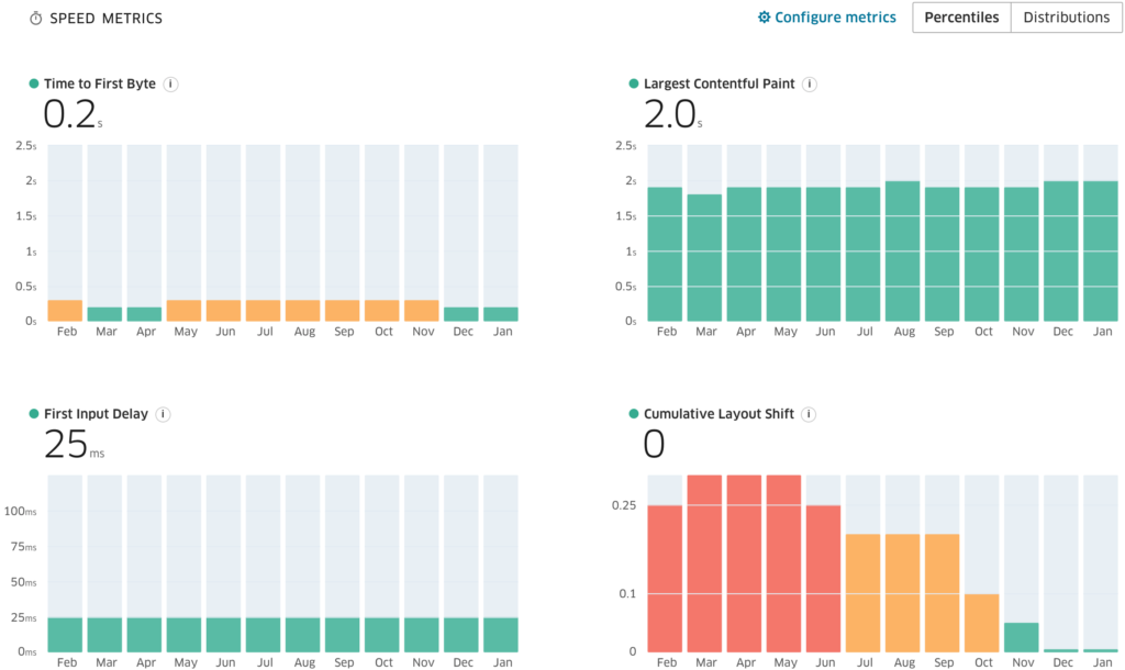
The visualiser at https://treo.sh/sitespeed shows CWV metrics over time, filterable by device, connectivity and geographic region. It is updated weekly and uses data from the CrUX report.
In the example below for bbc.co.uk, we can see how the CLS metric has dropped significantly in the latest 3 months, giving green ‘pass’ results for all core metrics. This is a great way to analyse the performance of CWV metrics over time or to conduct competitor analysis.
Visualising Third-Party requests
Interactivity metrics for FID, TTI and TBT can often be hard to troubleshoot. PageSpeed Insights can be useful in terms of identifying some of the heaviest third-party scripts, but sometimes a decent visualisation can communicate the impact of these scripts much easier.
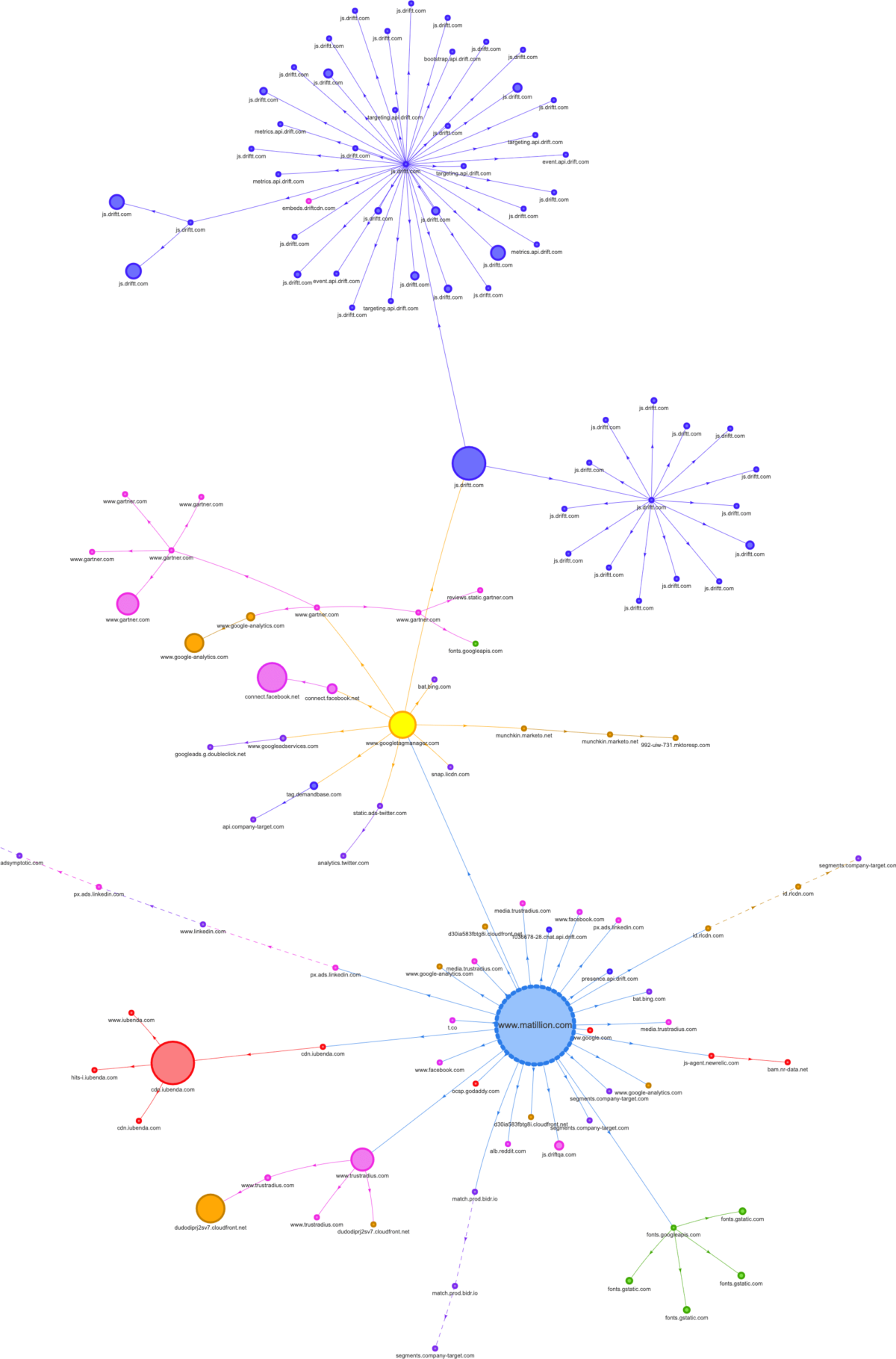
The Request mapping tool https://requestmap.herokuapp.com/ is great for this. The generated maps contain nodes for each third party request, with larger nodes representing higher impact scripts. If your interactivity metrics are poor, chances are you’re going to see a lot of nodes on this map.
Here’s an example from a site that has a whopping 26 seconds for the Time to Interactive TTI metric. A quick glance at the map shows a live chat widget, represented by the numerous dark blue nodes at the top, accounting for over half of the total requests.
The request map tool is also a great way to determine where scripts or other assets are loaded from. We can see below several nodes coming directly from the yellow Google Tag Manager node in this example.
Waterfalls in WebPageTest
WebPageTest reports provide a lot more detail than PageSpeed Insights and can be generated from various devices and locations.
I often use this tool for waterfall analysis, which visualises the loading sequence of all assets on a page. This can be particularly useful when trying to streamline your critical ‘above the fold’ content. For example, if you’re optimising for LCP and the largest above the fold element is an image or typography, you may want to implement preloading on the largest image and font files, and check these preloaded assets are appearing at the top of the waterfall.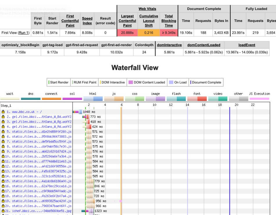
Unsure how CWV will impact your site, drop us a line today.